Every year the people over at put on a series of races in Show Low, Arizona as the Deuces Wild Triathlon Festival. Not only is it a great chance to head to the mountains, but all the proceeds head to charity. As with most large races, every entrant receives a race shirt of some kind, and these shirts are not just a t-shirt [anyone that runs in a t-shirt knows they are not “sweat-friendly”].
This year, the process began 6 months in advance, with a choice of one of the many colors of fabric that the manufacturer provided. At least we started with a sky blue. Where we finished… well, you’ll see.
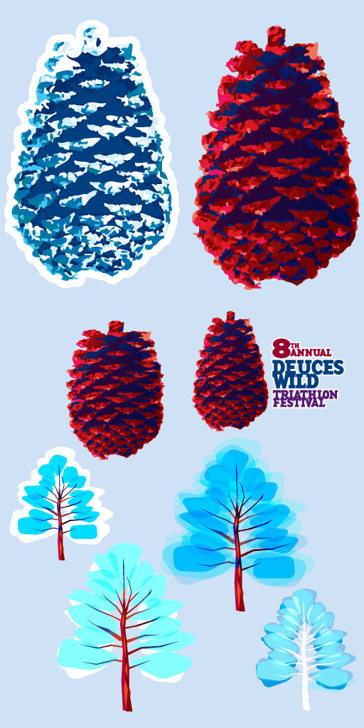
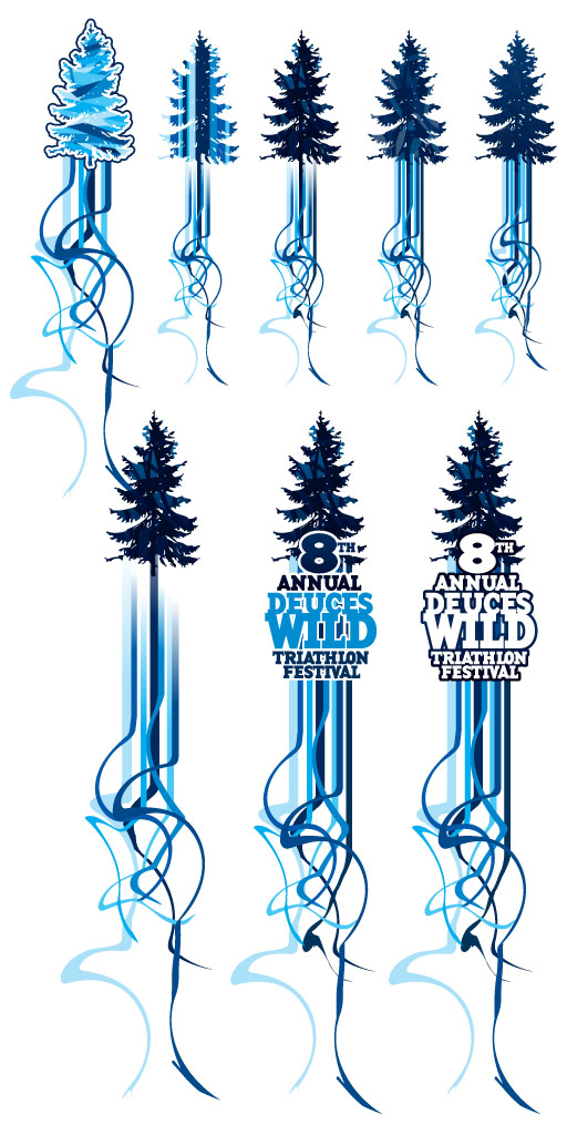
Pine cones and trees were the requested imagery, getting away from the infamous Club from the playing card that gave the town of Show Low its name. Though the pine cones were attractive, the tree struggled a bit.

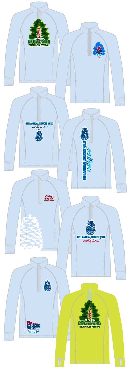
Plenty of mockups ensued, even trying another color to see if would help the tree pop a bit better. They tended to look a bit wintery.

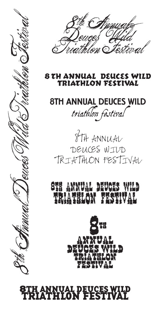
Dozens of typefaces are chosen from the many thousands we have, and the beginnings of a path to something attractive is started.

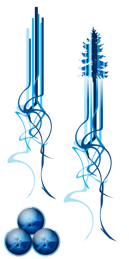
The original trees were scrapped fo one with more detail, and blue racing stripes were included. At the bottom are 3 spheres [similar to what would normally make up the Club] which was a happy accident.

The direction of the blue trees with the swirling ribbons was approved, and that resulted in several more versions, with the text added near the end. Some trees were lacking in contrast, while the first two just didn’t have much punch.

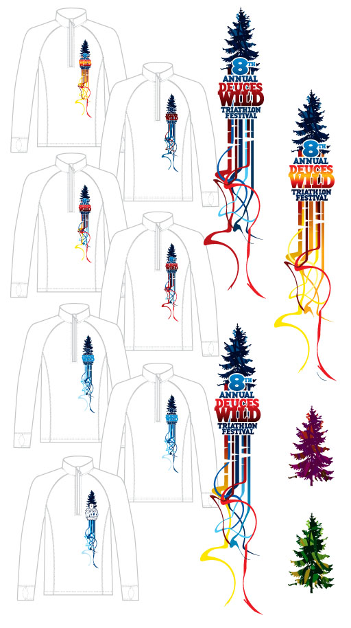
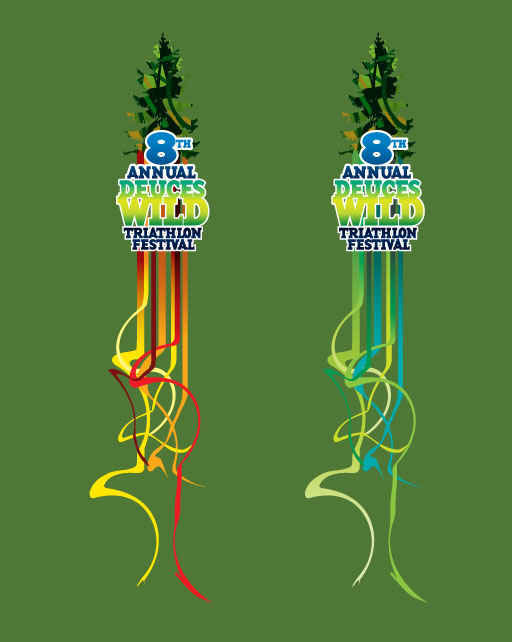
Too much blue! Time for some other colors, and after the samples were passed around some of the staff, the ribbons were referred to as being too feminine. Chips taken out of the ribbon along with hotter colors was the fix.

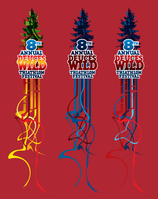
The blue fabric was given the boot and a chile color was chosen. Both the green/yellow and blue/red combinations looked good on the color.

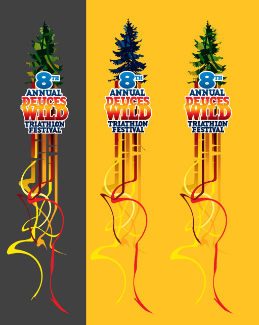
With the production time to get thousands of shirts done before the race getting shorter and shorter, it turns out that the manufacturer did not have enough chile fabric. Two other colors were chosen, both workable, and the yellow [manly] ribbons looked good as it faded into the yellow shirt at the bottom.

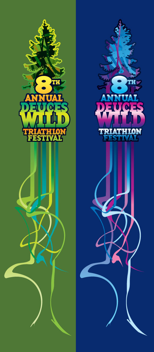
Not enough of that material either [and remember, this is special sweat-wicking material, too]. They had plenty of moss green, though, and once the cuts in the ribbons were removed, the green/blue/yellow version was approved.

ALMOST approved — they were just short of moss so a midnight blue for the women was chosen, and the green/yellow was swapped out for pink/purple. Below is the approved art for the shirts for both men and women.

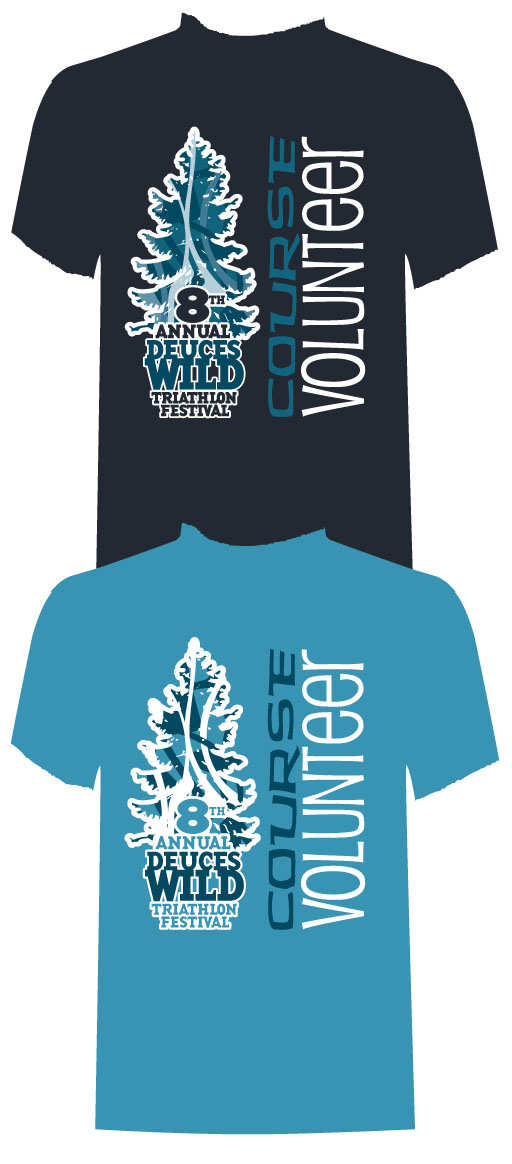
We weren’t quite done. This race is put on by a small army of volunteers, and shirts were needed to make these volunteers easily identified. While running through the backwoods, would you take the direction from some one telling to run “that way” or trust a person with a volunteer shirt on? Take the first choice and you may end up in Colorado. The light shirt was chosen, and with the simplified logo [dare we say it] it may have upstaged the race jersey.
We’ll be posting more designs for clothing that we have worked on, and expect photos of the clothing as well.
