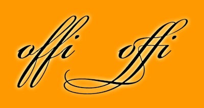
I enjoy the creation of wedding invitations not only because it is a wedding but because there is so little type which needs to be applied very well. Having a good design program that allows access to the special ligatures is a must. Ligatures create a special glyph to connect those letter combinations that look poorly together. Common ligatures would be the «fi» and «fl» glyphs. Adobe keeps a list of the potential creation of 4,281 glyphs which is amazing in itself. Don’t get me started on old style figures, small caps, swashes, ornaments, etc – access to these characters in a font is not going to be found in Office programs. I enjoy taking time to make sure the small details look great. The image below is what can be done with access to a quality font in with design software. Not only is it a better solution for the «fi» but a complete glyph for «ffi».
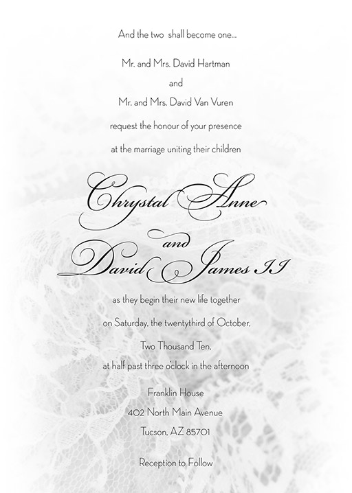
For the Van Vuren/Hartman wedding I went for classy and airy, slightly more than the «simple black dress» of wedding invites with that hint of lace texture. Very light and delicate.
The RSVP card matched well, and the there is a lovely grouping of swirls at the beginning. 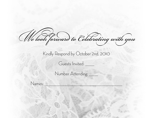
Clean and simple maps convey the area around the wedding.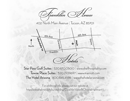
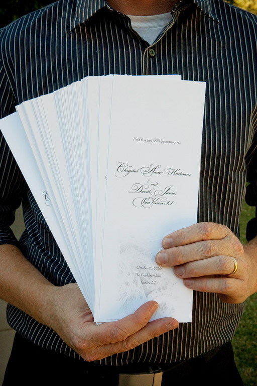
The wedding programs were larger to give them a bit more volume for the outdoor wedding. Printed on a thick matte paper, they would have doubled as great fans had the weather been warm.
