It happens more often than we would like to think – “I had this designed elsewhere, but I don’t like how it turned out”. Just because someone or someplace has a computer and software [in this case, Word] it does not mean that the result will be professional design. I’ll hit on this some other day, but when I had my kitchen redone, I did not build my own kitchen cabinets. There is a reason we have professionals. I’ll climb down from my soapbox though I do feel bad for people that get burned.
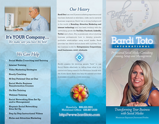
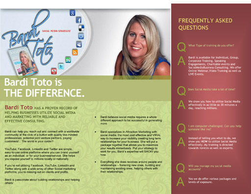
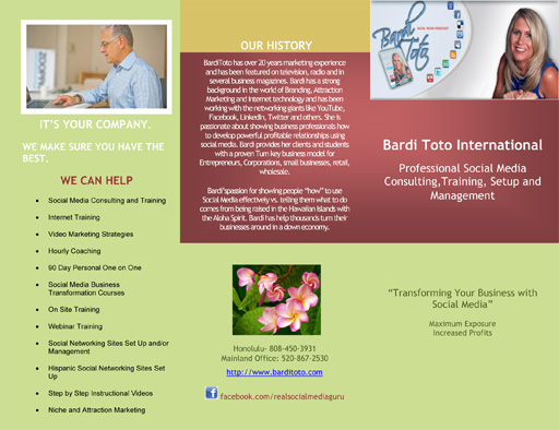
I’ll start with the redesign – clean, bright, inviting and relaxing. The blues capitalize on the various social media icons that are blue [more about that further below] and it helps make Bardi the focus of the brochure. Click on the images for a larger image.
Did I mention this was done in a time crunch as well? It was just under a 3 hour job, including stripping out the images from the provided Word doc, masking out images and formatting. See, speed DOES matter. Just think what it would look like if I had 20 hours to work with…
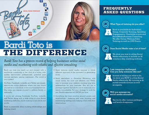
Below are images of the provided artwork. Blocks of color with little flavor, text without any flavor, though I kept the basic layout as that was fine with the client.
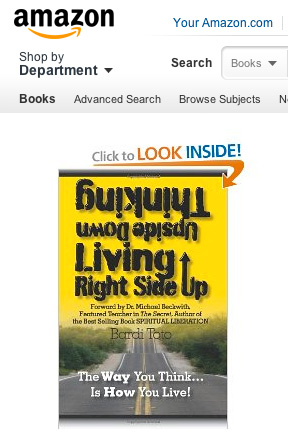
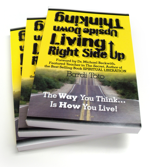
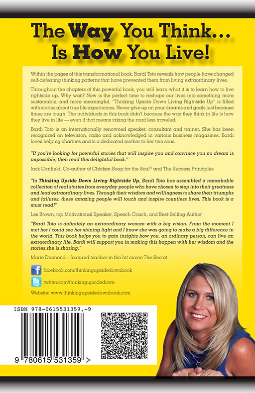
After this project, our book design services were utilized in the form of a 240 page book that needed to be laid out and prepped for printing first with us and then through Amazon. The cover came to us with this design but it was also a bit flat.

I still had several photos I had taken early one morning for another project, and the rolling hills worked great for the image beneath the title. I also moved the cover from being a list of information to something more dynamic and identifiable.

Formatting the inside of the book took a bit longer as any well formatted project should. I always take the time to create style sheets so that I can change any aspect of the book in a moment. Need the text larger? Done. Need a different font? Done. The light bulb was a nice touch to break up the chapters.
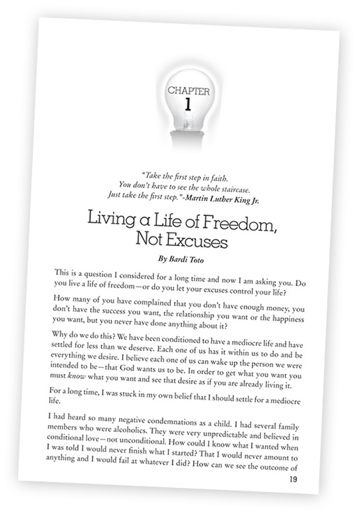
You may look through more pages at the Amazon.com listing here, and you could purchase it as well.
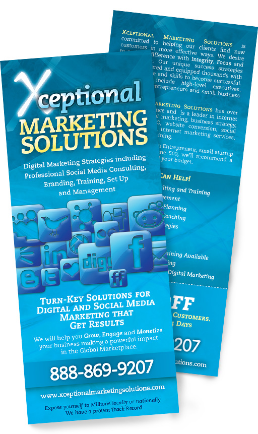
Last in the list of items came several months later in the form of a quick handout/rack card. I pulled all the social media logos I could find and piled them in an attractive manner, keeping with the blue from the first brochure. The variations of pale yellow and white on the blue helped form a sense of urgency which was what this call to action piece was to be about.
