Category Archives: Events

El Tour de Tucson Posters – The Early Years

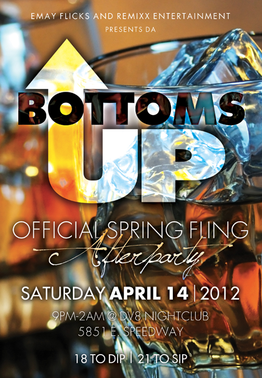
Three posters, coming up…

Just a week ago or so I was commenting on a bike ride that it was almost El Tour de Tucson time and that the weather should be going from «hot» to «just about perfect». Going along with the «If you think it, you will get the call» idea, I was informed of an upcoming magazine article about the art of the El Tour de Tucson bicycling event and that two of my posters were requested to be included. Then they asked for a third, so went back to my archives to pull the digital files [but not the 2006 poster previously detailed in this blog].

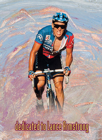
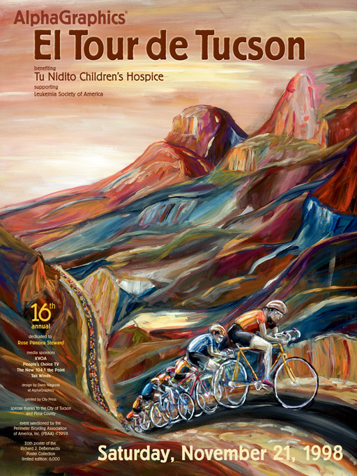
At the time of the first poster I created for the organization, the posters were all wonderful photographs but to me, they were lacking energy, especially as there are now over 9000 cyclists riding in the event each year. My first thought was a painting, and I am glad that I ran with that thought which was way better than making something out of pasta and glue, though I still think about that medium. My children look at this first poster and ask me if I know how to draw a bike [I do] but this cyclist was to be all cyclists, neither a racer or a recreational rider, heavy, thin, expensive road bike or old beach cruiser. I painted it purposefully ambiguous. It also happened to be the first year of Lance Armstrong’s return to competitive cycling after cancer, having previously won a single stage in the Tour de France in 1995. He returned to racing in 1998 and I claim no foresight into the rider on the poster wearing a yellow jersey.

1997 El Tour de Tucson Poster

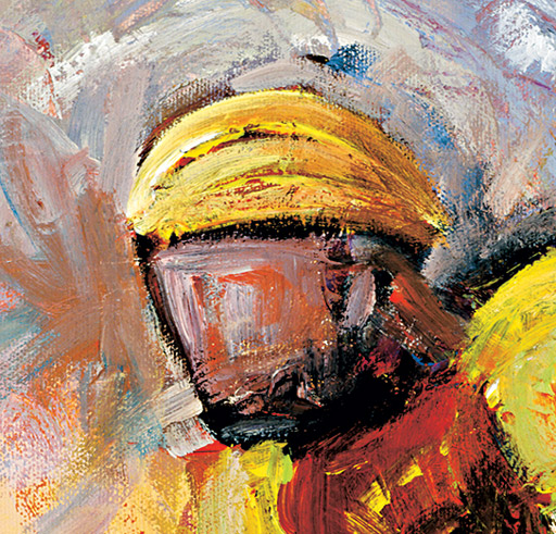
Close up shots of both Lance and the brushstrokes in the painting.

1997 Tour dedicated to Lance Armstrong

Close up of el Tour painting

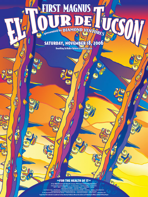
The following year I was asked to do another painting. This was back when the route went clockwise, and though the cyclists would not have seen the atmosphere look like this on the course, I wanted to capture that late November sun in Tucson. The sky is a bit yellow, and the shadows and colors stand out a bit more in the Catalinas – stylized, of course. If you have driven on Sunrise between Craycroft and Kolb, you know exactly where this could be. If you have been stuck in traffic waiting for what seems to be the longest line of cyclists ever created, then you get the idea behind the long strand of cyclists stretching into the distance. If I had to pick my favorite poster, this would have to be it. In more recent years the poster art doubles as the art for the cycling clothing and this would not translate well.

If you happen to be in Casa Molina on east Speedway, excuse yourself for a moment and you’ll find this poster hanging in the hallway leading to the restrooms.

1998 El Tour de Tucson poster

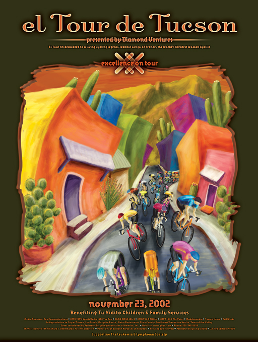
This last poster of the three chosen tends to be the crowd favorite. Not any particular area or barrio in Tucson, it depicts the early start downtown and the brightly colored buildings that are found sprinkled here and there some of the older parts of Tucson. It definitely shows what seems to be the craziness of a pack of cyclists coming through the smaller city streets.

At the time I had very little time, and it was an entirely digital creation. In 2002, that put a lot of hurt on my computer but it came out just fine. If I was ever to repaint a poster, this would be the one, just to recreate it with more detail and brushstrokes.

2002 El Tour de Tucson Poster

Van Vuren Wedding Invitation and Program

I enjoy the creation of wedding invitations not only because it is a wedding but because there is so little type which needs to be applied very well. Having a good design program that allows access to the special ligatures is a must. Ligatures create a special glyph to connect those letter combinations that look poorly together. Common ligatures would be the «fi» and «fl» glyphs. Adobe keeps a list of the potential creation of 4,281 glyphs which is amazing in itself. Don’t get me started on old style figures, small caps, swashes, ornaments, etc – access to these characters in a font is not going to be found in Office programs. I enjoy taking time to make sure the small details look great. The image below is what can be done with access to a quality font in with design software. Not only is it a better solution for the «fi» but a complete glyph for «ffi».

For the Van Vuren/Hartman wedding I went for classy and airy, slightly more than the «simple black dress» of wedding invites with that hint of lace texture. Very light and delicate.

The RSVP card matched well, and the there is a lovely grouping of swirls at the beginning. 

Clean and simple maps convey the area around the wedding.

The wedding programs were larger to give them a bit more volume for the outdoor wedding. Printed on a thick matte paper, they would have doubled as great fans had the weather been warm.


2012 USA Triathlon Duathlon Championships T-shirt Design [whoa that was long]

Once again Oro Valley and Tucson host the USA Triathlon Duathlon Championships on April 28, 2012 and we’ll be there with a T-shirt design. In case you were wondering, a duathlon is run-bike-run not swim-bike-run for a triathlon. I suppose that makes my bike riding just an athlon. I have yet to see the completed shirts and their may be embroidered shirts as well. TriSports.com is sponsoring the championships, just as they most every race in Arizona. Not only are all of athletes very appreciative of their investment into our sports, they are also highly involved with our community, our environment with their huge water harvesting barrels look like missile silos and their solar energy panels providing shade for their entire parking lot – smart move there. I could go on, but it has to be mentioned that the entire company is made up of [and owned] by great people. Below are less than half of the ideas I came up with for the t-shirt design. I’ll be cheering on a teammate who already has multiple state cycling championships as he races tomorrow, adding his 4 minute mile skills to his riding. It would be great if he pulled off a podium finish.

All in all, it is a win-win-win-win-win for our cities, athletes, TriSports.com and other local businesses – and for those of you that pick up a commemorative championship t-shirt.

I started of simple with some imagery specific to the southwest [saguaros and chilis – suprise!]

With the course up in Oro Valley, adding the backside of the Catalinas with Table Mountain helped tie in the location a bit more than just cacti, and a runner and cyclist were added. The shirts need to appeal to both women and men so I kept the feel right down the middle.

A quick two color version for embroidery was created, and dealing with thread always comes with limitations.

When it was all said and done, 3 designs were chosen and I am waiting to be surprised on which was used [all 3?] when I pick up a shirt. The logo was changed to include location and date. Of course I am hoping they sell out of them, but only after everyone that wanted one got one.

Spring Fling After Party Card

The University of Arizona’s Spring Fling Carnival is the largest student-run carnival in the nation [probably in the world?] and has been a regular event for nearly 40 years.  I once won an inflatable airplane while playing roulette at one of the booths – I am sure you wanted to know that. The end of March through most of April is usually one of the best stretches of weather in Tucson with plenty of sponsorship walks and sporting events taking place.

Enough of the pitch for Tucson – here is a quick card for an after party in one of our local clubs. Rich colors, interesting type – an overall good looking piece. You need it, we design it.

’10 Credentials for University of Arizona Football

These credentials led off my design style for the 2010-11 school year with the white outline and shadow and nearly white background [I’ll be posting the rest of 2010 soon enough]. The design carried the red and blue colors well, while highlighting the players. With the thin white outline [like a paper cut out] the players were both frozen in a moment in time as well jumping out of the noise and chaos of the game and stadium. Add in a bit of a reverse glow darkening the inner edge of the player and the effect was complete. Why make attractive credentials? One was help bring the look of the program up a notch [every little bit helps] as well as making keepsakes. There was just one hangup — these sports credentials were beginning to get rather complex, both in amount of unique credentials as well as their ability to be easily identified by security personnel. For each game, there were 11 different credentials to keep track of [a total of 84 unique credentials for the season] and though they are attractive, a bit of functionality was lost.

I’ll spare you the numbers, but 4 All Season passes for All Access, Photo and Media, and then 11 game specific credentials with 7 games played made for 84 unique credentials with each set getting a unique set of numbers [per game]. It is a good thing to have some personalization software to add into our page layout application.

All this to say the credentials were produced without a hitch, and another exciting football was had.

Deuces Wild Triathlon Festival Clothing

Every year the people over at put on a series of races in Show Low, Arizona as the Deuces Wild Triathlon Festival. Not only is it a great chance to head to the mountains, but all the proceeds head to charity. As with most large races, every entrant receives a race shirt of some kind, and these shirts are not just a t-shirt [anyone that runs in a t-shirt knows they are not “sweat-friendly”].

This year, the process began 6 months in advance, with a choice of one of the many colors of fabric that the manufacturer provided. At least we started with a sky blue. Where we finished… well, you’ll see.

Pine cones and trees were the requested imagery, getting away from the infamous Club from the playing card that gave the town of Show Low its name. Though the pine cones were attractive, the tree struggled a bit.

Plenty of mockups ensued, even trying another color to see if would help the tree pop a bit better. They tended to look a bit wintery.

Dozens of typefaces are chosen from the many thousands we have, and the beginnings of a path to something attractive is started.

The original trees were scrapped fo one with more detail, and blue racing stripes were included. At the bottom are 3 spheres [similar to what would normally make up the Club] which was a happy accident.

The direction of the blue trees with the swirling ribbons was approved, and that resulted in several more versions, with the text added near the end. Some trees were lacking in contrast, while the first two just didn’t have much punch.

Too much blue! Time for some other colors, and after the samples were passed around some of the staff, the ribbons were referred to as being too feminine. Chips taken out of the ribbon along with hotter colors was the fix.

The blue fabric was given the boot and a chile color was chosen. Both the green/yellow and blue/red combinations looked good on the color.

With the production time to get thousands of shirts done before the race getting shorter and shorter, it turns out that the manufacturer did not have enough chile fabric. Two other colors were chosen, both workable, and the yellow [manly] ribbons looked good as it faded into the yellow shirt at the bottom.

Not enough of that material either [and remember, this is special sweat-wicking material, too]. They had plenty of moss green, though, and once the cuts in the ribbons were removed, the green/blue/yellow version was approved.

ALMOST approved — they were just short of moss so a midnight blue for the women was chosen, and the green/yellow was swapped out for pink/purple. Below is the approved art for the shirts for both men and women.

We weren’t quite done. This race is put on by a small army of volunteers, and shirts were needed to make these volunteers easily identified. While running through the backwoods, would you take the direction from some one telling to run “that way” or trust a person with a volunteer shirt on? Take the first choice and you may end up in Colorado. The light shirt was chosen, and with the simplified logo [dare we say it] it may have upstaged the race jersey.

We’ll be posting more designs for clothing that we have worked on, and expect photos of the clothing as well.

10 Years in the Making

We’ve made it to the Sweet Sixteen and more. One could say this may be some payback for the 2001 loss to Duke in the championship game, but it may just be better to say that Arizona played one of the best second halfs EVER and transformed Duke from a never-ending powerhouse into a handful of guys that looked lost on the court. *whew!*

If anyone remembers the old NBA Jam video game [they have a new version out now] there were two frequently repeated phrases in the game. “He’s on fire!” and “He can’t buy a bucket!” – we were on fire last night. Let’s hope that fire continues.

The credentials for the previous year had exactly that – some flame action going on. Here are a handful of the credentials, as well as a look into the process of coming up with them.

How much flame is too much flame? Where does “Staff” and the year go? Believe me, there were plenty more iterations than just the few shown here.

On a few of the credentials we went with wood from the court, but should it be Arizona red or more like the original wood?

PAC-10 Champs & March Madness!

A day after the University of Arizona men’s basketball team became the PAC-10 champions and finished an undeafeated season at home I happened to bump into a friend visiting from  Cincinnati. He works with the athletes at Xavier where we pulled their coach. “Thanks for letting us have you coach,” I gleefully told him. Who would have thought that Arizona would be back to being competitive so quickly? Not I. We are back to the big dance, and who knows — maybe we will put in another 25 year string of appearances.

Each year we get to create the credentials for many of Arizona’s teams, and we put a bit more into the job as it is our team as well. In the end, there are individual credentials for a myriad of positions and sets for both season-long and game-by-game passes. If you are thinking of being sneaky, good luck with that — not only do we shred everything that we don’t ship, but we create identification sheets for the security members at the games. Did we mention that we also apply barcodes on credentials? We want everything surrounding the games to be safe, as well as look good [because that is what we do].

Good luck in both the PAC-10 Tournament as well as the big dance — here is hoping that we at least make it into the sweet sixteen!


’09 Football Credentials

With the credentials for 2010 wrapped up and in production, we can now show you last year’s credentials. We take security very seriously and didn’t want to take the chance of the 2010 credentials looking even remotely similar as to 2009. BUT, you really must attend a game this year and check out the 2010 versions as they are going to be great.

This all goes back to our desire to not just make good design but to make everyone else look good as well. We want the athletic department to look good, that people coming from other schools to a game and being given a credential will look at it and think, «whoa, this school is top notch». Granted, we take on all kinds of design work and we try hard to make everything we touch look good, but this is also our hometown team – we take pride in what we can do to help out.

Included below are a few of the dozens of credentials we create for each game, as well as a few large versions of the credentials without the required text. They would make for a nice set of playing cards.


Maybe we should be a bit more impartial, but having a UCLA player being bowled over on their head — it makes us smile.