This set of logos were part of the first round of concepts for updating the event logo. Starting in black and white can uncover the flaws that are easy to cover up in color. 
Category Archives: Logo/Identity
Trip to the Olympics: Project Killed
Gold medal design left on the blocks
All AlphaGraphics are owned by franchisees, with the AlphaGraphics headquarters in Salt Lake City [though it was founded in Tucson], and there was a great promotion planned for a trip to the Olympics. After going ’round and ’round on getting the franchisees to buy in, the promotion never got off the blocks though it did hear the gun. The final design of the medals were beautiful, with a nice cloth texture for the ribbons. Are we allowed to give ourselves a medal for what is literally a gold medal design? Yes we can. Leading up to this design were several comps in Adobe Illustrator to get the composition fine tuned before pulling it into Adobe Photoshop to build the 3D portions and add the textures.

The following promotion never happened, though I wish it did, and I wish I could have won it. I’ll have to settle for winning the VISA contest instead.

Here are some of the ideas for the composition of the final piece.


We do more than just design — add in full production of most everything necessary to open a business
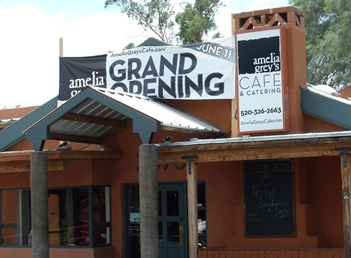
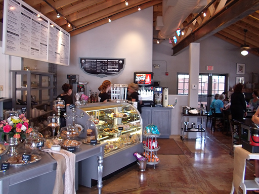
There are benefits to being a designer within a larger business, and most of those benefits can be directly realized by our clients. Maybe you have been there — taking your logo to a handful of businesses to get different items produced, dealing with people not having the right software, color problems, and explaining everything repeatedly. And in the end, you hope that all the pieces work together. That doesn’t have to happen as we produce a wide range of products in-house. Design, yes, and printing and copying — those are a given most everywhere. When Amelia Grey’s Cafe & Catering was preparing to open, we covered a bit more than just those three. The photo below? We did none of that though is does make the mouth water.
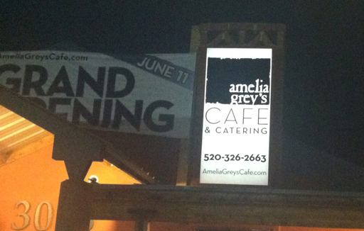
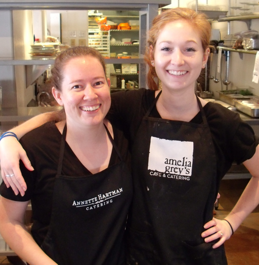
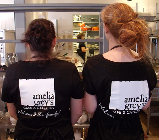
We started off with two logos, one for the cafe and then another for their catering business. After dozens of ideas, the large block for Amelia Grey’s would make a great mark that would be memorable as well as the pairing of two typefaces that play well together. For the catering it was a bit more classy, almost modern nouveau but not exactly. So step one [at least on our end] was complete – on to the rest of the necessary items.
We do large format printing, so the Grand Opening banner needed to be up to promote the new business, and we do cut vinyl as well, so we replaced the previous back-lit signs as well. That saved a trip to the sign company, seeing how it was all done in-house. What isn’t shown are two more street-side backlit signs, and if you look real close in the image below you can barely make out the cut vinyl logo and hours in the window — we do those too.
You can’t sell food without a menu, so that was next. We produced them as well and they are shown sitting in a homey basket below.
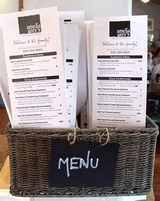
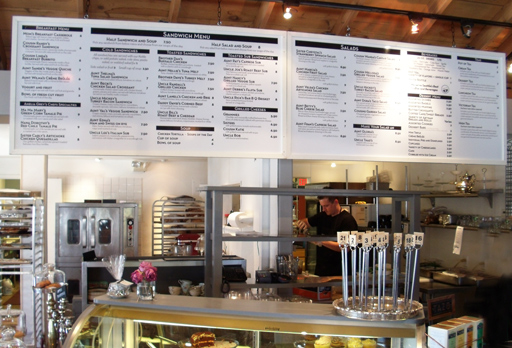
There was a fair amount of time to get that menu to both flow and be legible on the menu boards and they came out great. Most anyone standing in line can easily read the menu.
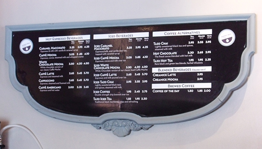
There was also the coffee menu, which was put on an old inverted head board which has great style on its own.
Shirts and aprons? We can print on those as well, with Amelia Grey’s shirts and aprons with each of the logos on them, depending on the event.
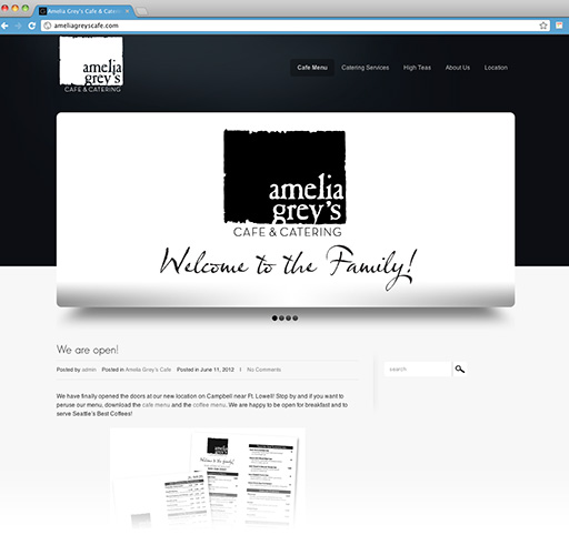
I am still working on the website — now the cafe is open and serving customers, there are a lot more photos to put up as well as setting up the online ordering for their catering services. It’ll be dolled up soon, and the online ordering should be helpful.
What else? Labels for the food packaging [little round ones to close up the packaging and on the sandwich paper, as well as for label fights], business cards and soon to be invoices along with other promotional material. Go visit them at AmeliaGreysCafe.com. Better yet, head over there for a High Tea or for lunch. Welcome to Tucson, Amelia Grey’s Cafe & Catering — local businesses are good businesses!
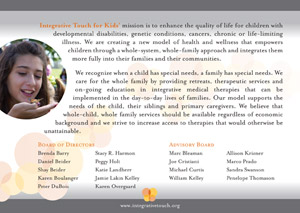
Integrative Touch for Kids gets the first medal of the year
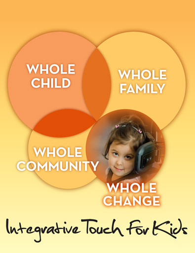
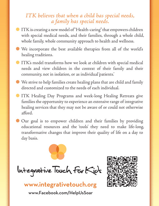
It is another Olympic year with international athletic competition taking center stage where thousands will compete but only a few will medal. That does not seem fair, so we are handing out our own medals to those groups that we work with that deserve a medal. The first medal of the year goes to Integrative Touch for Kids [ITK] which believes that when a child has special needs, the whole family has special needs. As their material states, “Did you know that a child with cancer has a better chance of surviving their illness than their family does of staying together?” Their success is a success for not only the child and their families, but the community as well which is why their catch phrase [mission statement?] is “Whole Child • Whole Family • Whole Community”. To quote a mother on ITK’s site, “Before our involvement with ITK, our family was stressed and disconnected from one another. Now we talk more, understand each other better, and feel much more calm and connected.”
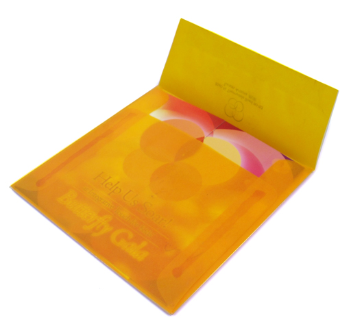
These were delivered in a translucent orange envelope.
If I remember one story correctly, one child made some friends at a retreat and was invited to a birthday party. As a parent of a child with some unique needs and is socially behind, getting invited to a birthday party is a big deal – not just for the child but also for the parents.
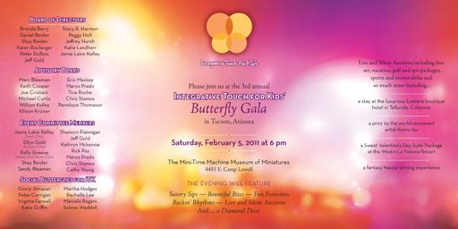
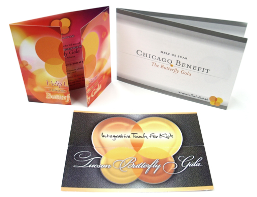
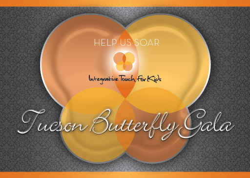
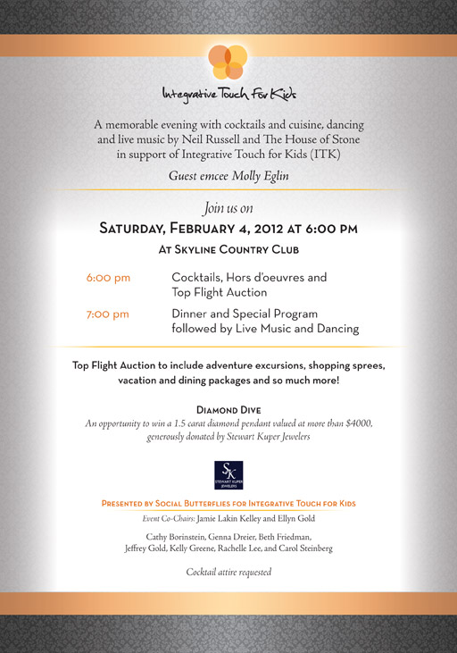
Integrative Touch for Kids just held their Butterfly Gala in Tucson this past weekend including dinner, raffle and auctions. Go check them out at their website. ITK, you deserve more than just a medal – thank you.
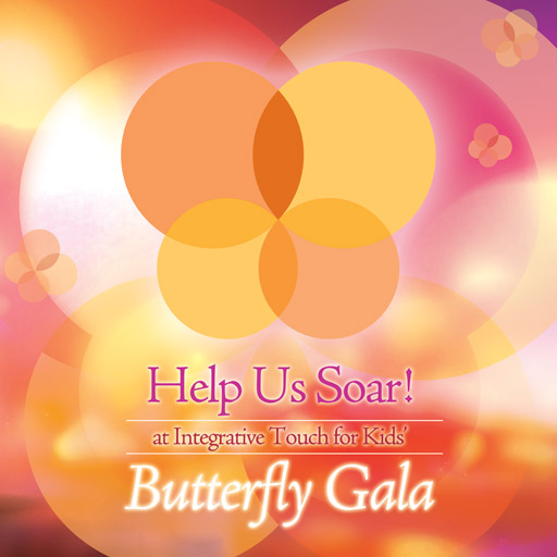
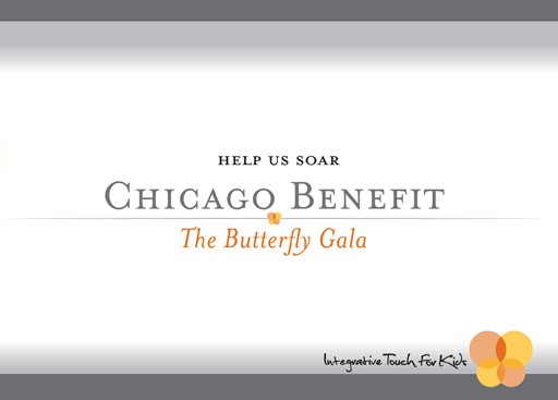
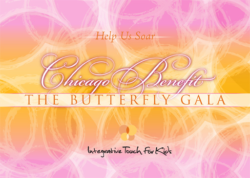
In for the direction of the design of all their pieces, keeping it light and magical has been first and foremost. The three latest invitations all have gate folds which works well with the butterfly theme.
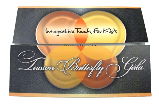
The first Chicago Butterfly Gala may have been one of my favorite. Very clean and elegant, but it didn’t have as much magic as some of the others.
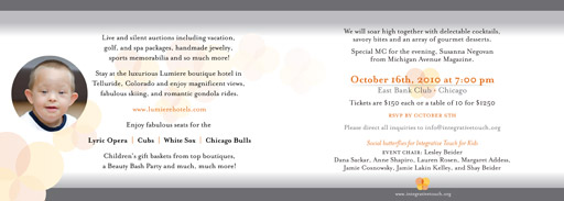
The second Chicago Butterfly Gala invitation was overflowing with magical, light and energy.

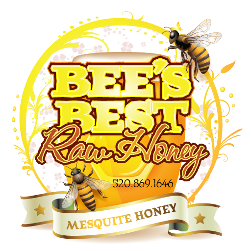
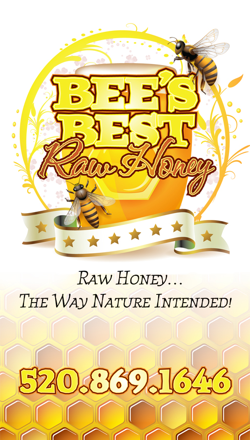
Bee’s Best Honey Labels Design
This was a very quick design for client looking to get a couple hundred circle labels for his honey jar lids. With our large format printer, printing and die-cutting was not an issue, though it can cut any shape and round really isn’t a challenge. Pulling from our stock images I put together a decent background and then it was the type. Type is frequently underrated, often times getting thrown into a design like someone writes a list of things to do – they just put it on there. That isn’t my style, and careful typography is a bit of a craft. The result was a great design that should help these jars of honey fly off the shelf – okay, not literrally, but you know what I mean. There was also a business card that needed creating, and with very little information to put on it, a honeycomb background was a perfect fit.
Sopapillas, anyone?
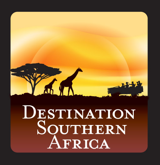
Destination Southern Africa Logo Redesign [Okay, a bit more of a touch-up]
Destination Southern Africa [DSA] was started 10 years ago, offering tailored vacations to Africa. They have plenty of travel packages, and unfortunately we all missed out on going to see the FIFA World Cup in 2010 through them. Next time…
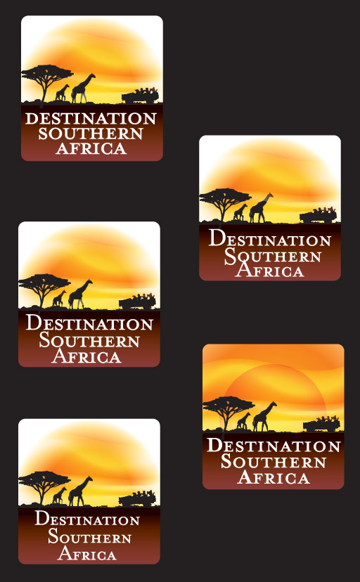
As most companies do, DSA started small and created their own logo. It makes sense – with any new business, cash is tight and spending money a logo is not usually one of the top 10 things clamoring for the business’ money [phones, maybe chairs – those things are important]. Of course, I would say seeing a logo is often the customer’s first interaction with a business, along with the human side of things, but I won’t go that route, at least not today. After 10 years, logos can get a little stale as well as not showing the same level of professionalism that the company now holds. This is where DSA found themselves, needing to sharpen their logo a bit, and I set to work on redesigning it. Below is the original logo, which had a few modifications of type and color over the years. It could be an awkward logo to put into use in material, and the name didn’t stand out as much as it should..
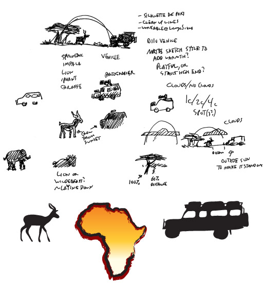
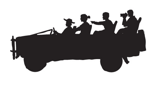
The initial conversation had me going with something similar, trying to keep with the sunset and the silhouette, both the most recognizable parts of the logo. A new Land Rover D110 was also in the mix as that is the safari vehicle most frequently used. Other animals were brought up, and though the focus is to be southern Africa, it is not the most recognizable shape – at least compared to Italy or Japan. Below are some of the quick notes and doodles that came of that first conversation.
After some mulling over of the concepts in my head [there is always mulling] I ran out several dozen ideas [not all of them are shown]. I stuck with the circle from the original logo and added the bottom as a place to anchor the logo and the text. A few different sunsets, a potentially rough hand-hewn logo, and a double ring to bring the logo into focus seemed to help keep the look while giving the text a prominent place. The 3 logos with check marks were chosen by the customer as ones to develop further. I did have in mind an old stamp or sticker that would have been found on travel trunks in the 1800s, but the push was for something clean and new and easy to use.
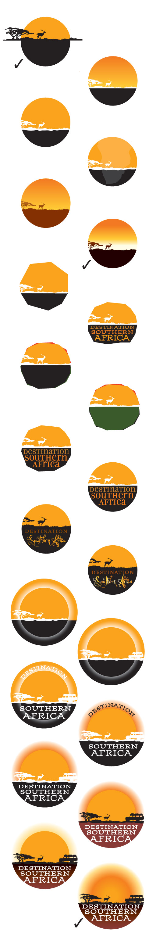
Another large part of logo design is the typeface and potential modification of the letterforms. I pulled a few dozen from our 10,000+ typeface library, ranging from the very clean to the playful. Three of them stood out to the customer, and they all happened to be part of the same family.
More logos were created, this time with a square bottom to give the text more room, and a giraffe was added in as they are highly recognizable. A few trees were created, but what I really wanted to do [and did] was create a far more dynamic sky and sunset. It really helped make the logo alive while retaining the same general look as the original logo.
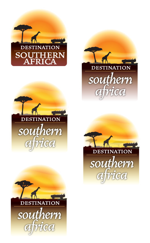
Two logos were chosen from that group, and people were added into the Land Rover as well as baby giraffe.
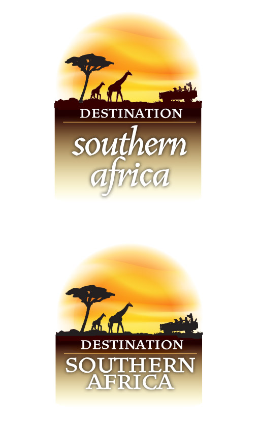
I took both of these and dropped them into an image just to see how the logo would fit, and the transparent edges seemed to work rather well, though I was a bit more fond of the first pair with the darker background.
At this stage in the game, the design is getting pretty tight with only slight modifications, and with that in mind, the client pointed out that the word “Destination”, though equally important in the name, had lesser prominence than “Southern Africa”. The round sun was called into question, and that was squared off as well with a few versions of how the sunset would work. I moved the background over to a rich earthy burgundy to add more warmth to the logo.
I had forgotten that the silhouette had just been a quick doodle and it was pointed out that the last person in the vehicle looked like a babboon. That might make the safari a bit more exciting, but the vehicle needed an overhaul.
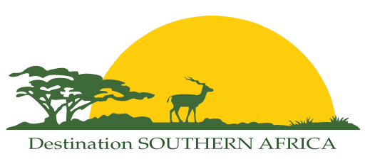
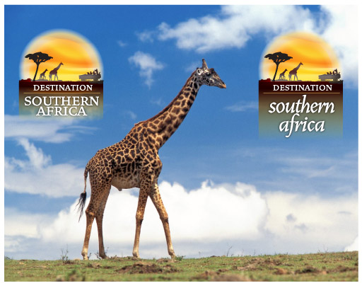
That was it – a little sliding around of the text and DSA has a logo to last at least another 10 years, all created as vector are in Adobe Illustrator [100% Photoshop free!]
BARRacuda Swimworks Logo Creation
 A friend asked me to create a logo for her swim instruction, but her swim credentials are a bit higher: 4 time US National Champion [18 time US Nationals finalist], Olympic Silver Medalist, 3 time NCAA Champ and 4 time All-American. She won her first national championship at 13 [or was it 12?] and she has a wikipedia entry. Any thoughts of her ability to instruct should have long since evaporated. If you are in Pensacola and want to work on your swimming [and fall somewhere from beginner to competitive swimmer/triathlete] I’d suggest giving her a call. She is a great person to be around – I believe I have started to swim faster just by talking with her. Visit her Swim Works site on Facebook.
She provided an apt name for her by playing with her last name [Barr] and adding a little “acuda” to spell out one of the fastest and most tough looking fish int the ocean, the BARRacuda [go check out some photos if you don’t know what one looks like]. I set to work on some sketches and what follows is the step by step process I use for most of the logos I create. Lots of sketches, then plenty more versions cleaned up in Adobe Illustrator.
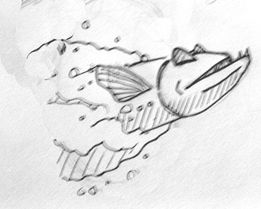
This is not how they swim, but it should.
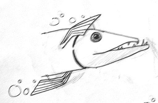
They always seem to be smiling, with a mouth full of nasty teeth.
Swim goggles? Maybe.
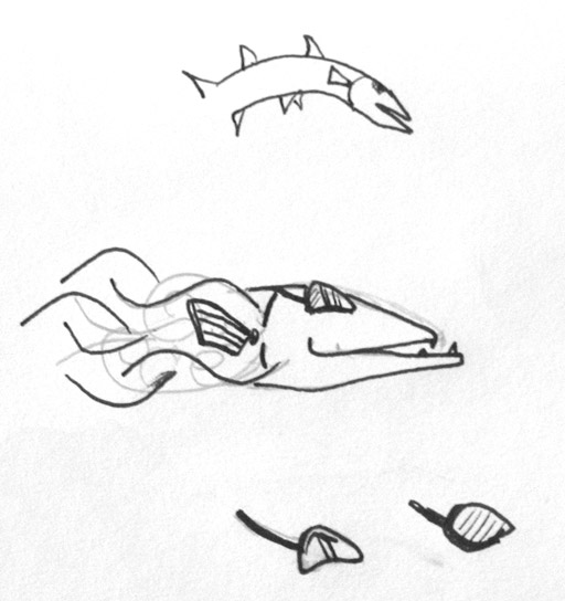
A little more doable, with the dynamic swirls [somehow it needs to scream SPEED].
Head on? Maybe a pack?
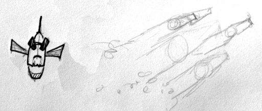
Maybe from living and training in Florida helped conjure up some NASA rocket imagery. Rockets are fast, too.
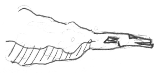
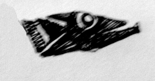
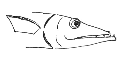
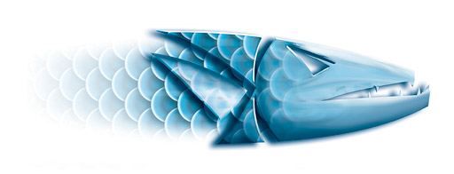
One version was narrowed down, and after several more renditions, one particular logo was chosen, but it needed a bit more energy. For those wondering why it was done in black and white vs. beautiful color, it is that color makes it too easy. A color logo or image contains more information, but it needs to be a good logo to survive as black and white. Black and white always comes first.
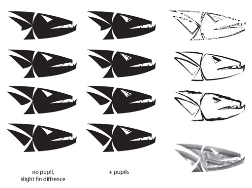
Once one was chosen, the text was introduced.
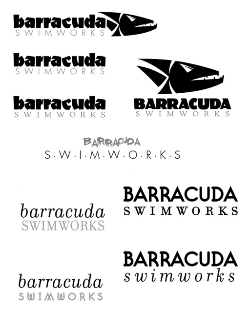
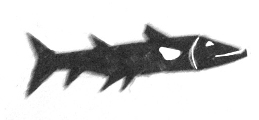
And the final black and white logo was produced.
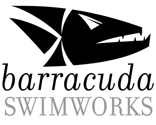
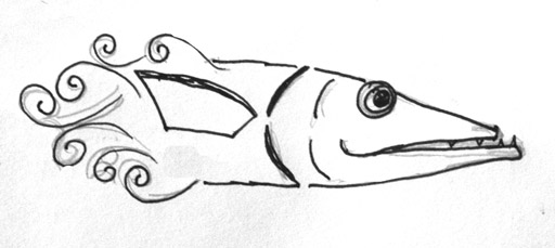
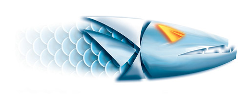
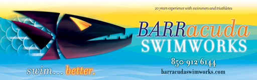
Next came the color version, and both color and texture could be added.
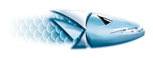
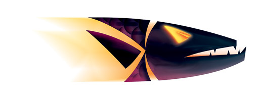
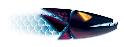
That last purple barracuda with the glowing yellow eyes was the one.
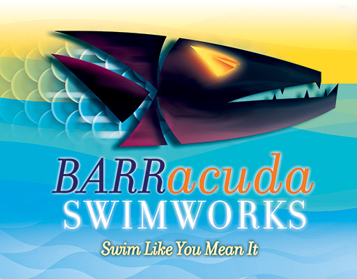
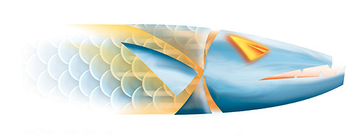
It easily lends itself to banners, postcards, business cards, etc. Here it is as an 8 foot long poster. Don’t worry about the website – that should be coming soon.
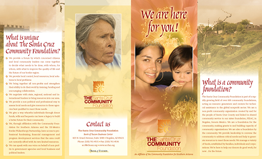
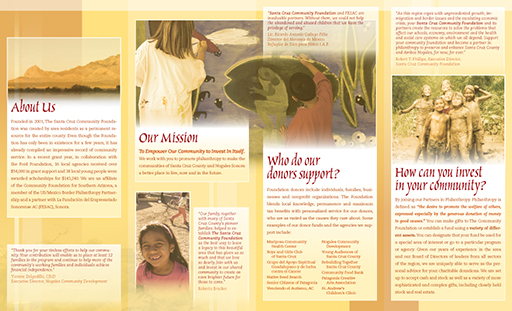
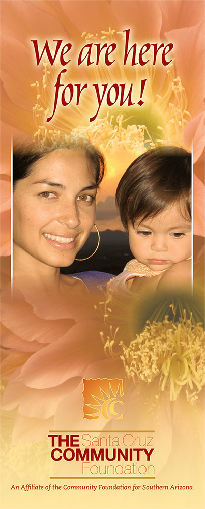
Santa Cruz Community Foundation
The Santa Cruz Community Foundation needed a look unique to its location though it still remains an affiliate of the Community Foundation for Southern Arizona. What we came up with was a soft, warm brochure that pulls towards Santa Cruz County, especially now in November with the golden sunsets and long shadows crossing the high deserts up to the mountains.
They are a great group of people – go check them out, and check out a pdf of the brochure.
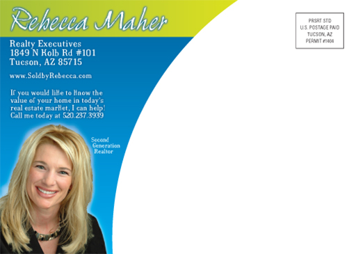
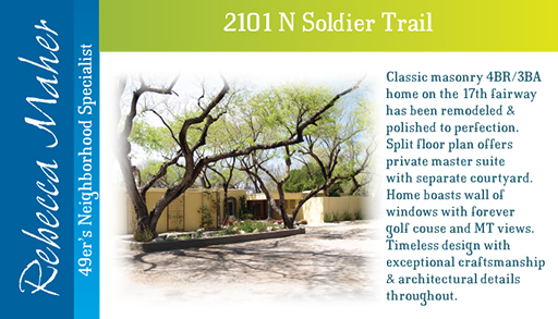
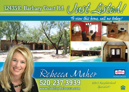
Rebecca Maher Realty
For a while, it seemed as if everyone and their uncle were either realtors or loan officers – that is, until the market turned a bit sour. Those that were the best survived, and Rebecca is definitely one of them. It used to be that one could write a phone number on a sticky note and put it on the door of a house and it would be sold before the day is out. Now we have to do a bit more than that, and good looking flyers, signs and business cards are very helpful. We worked on a new look for Rebecca’s material, going with a fresh look and peppy colors.
The 2 following images are to her postcards.
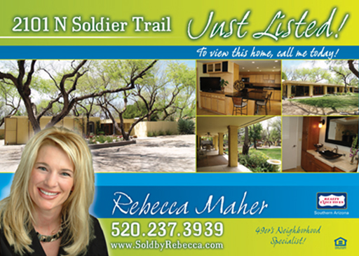
Every home requires a good looking sign as well…
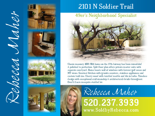
and don’t forget the business cards.
Every property gets the same treatment.
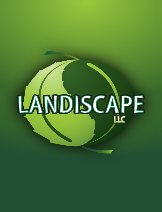
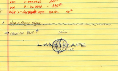
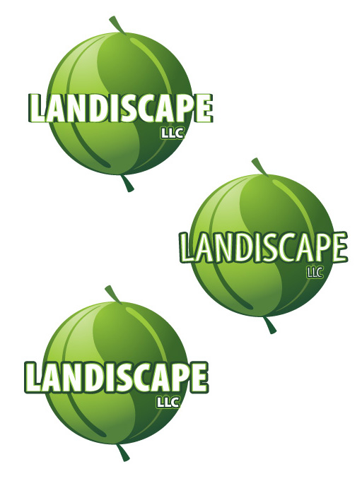
Landiscape logo, the creative process from doodle to finished design
Ever wonder how a logo is created? We can assure you that it is never done on the first try. All those great logos that we see every day – they took several revisions [and for big companies, years] until the right look is found. Follow along as we go through the logo process for Landiscapes, LLC.
Here is the original customer provided doodle, two leaves in sort of a yin/yang format. It is a great concept, but it needs to be turned into a clean logo, and that is where the fun begins. Though the following images have 3-5 logo ideas on each, there were many more ideas that we aren’t showing here.
How many veins? How thick should they be? Are there veins and how will the text look over them? We start out in black and white as that is the least forgiving. Starting with color often results in a logo that doesn’t look very good, nor does it print well in black and white. Color makes logos look better than they really are.
We tried a few block typefaces as they should stand out well when given a black outline.
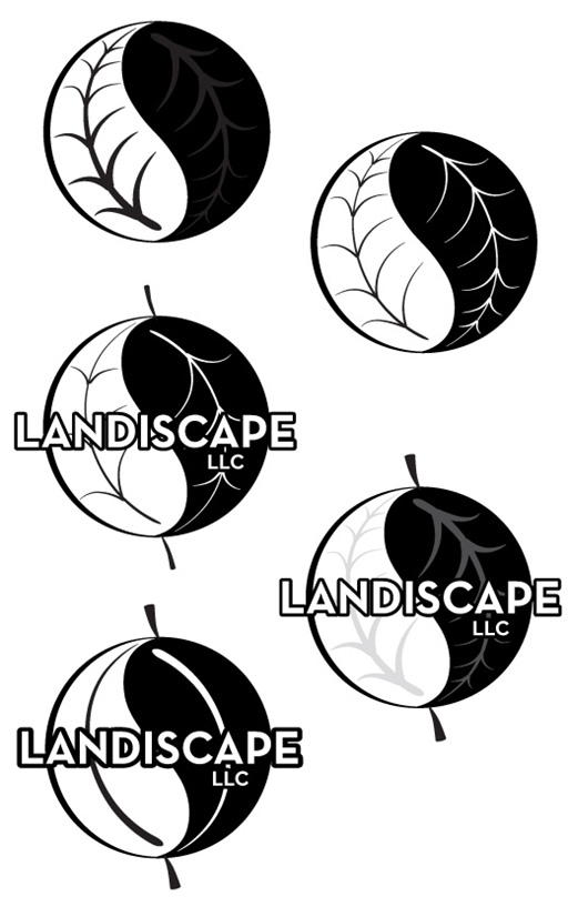
The customer requested some oriental looking typefaces [okay, pseudo oriental fonts] and we pulled out a few from the thousands we have. Many typefaces look great with a lot of characters, but when there are just a few, they can stand out like a sore thumb.
The simple leaves without a lot of veins is less busy and helps make the logo look like a sphere.
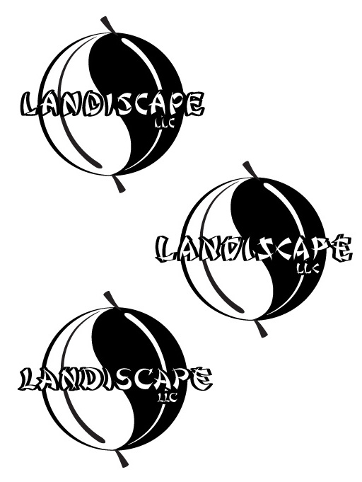
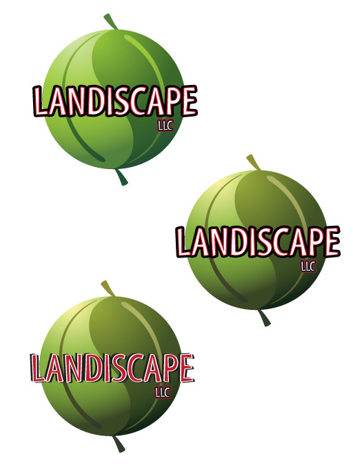
Since we were getting close, we started adding color. They asked for red and blacks, so we obliged. The bottom logo had the most promise, but it was too bold and the leaves didn’t fit well. None of the text applications are very readable.
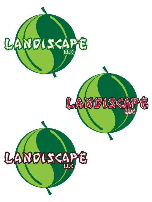
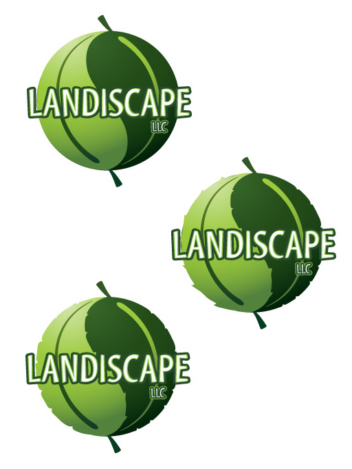
Dropping the black and red, and muting the greens and adding a gradient into the leaves. Now it is looking a bit softer and a bit more inviting.
A few more typeface variations…
Then we get back to the black and red, which is a bit much. It is just too hard to read.
While playing around with the logo, we thought, “What if we roughed up the edges so that it looked more like leaves vs looking like a really nice melon or pea?” – it turned out to be a good idea.
The client didn’t like the stems of the leaves, and he was right – it almost looked more like a balloon or melon. We tried a few variations.
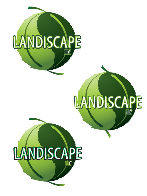
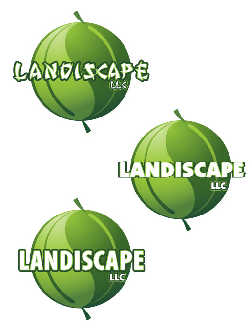
In the end, the client asked us to flatten the leaves just a bit, and that helped make the company name stand out a bit more. He was very happy about the logo and has been getting plenty of compliments, so that means we have done our job — making our clients look good.