Ever wonder how a logo is created? We can assure you that it is never done on the first try. All those great logos that we see every day – they took several revisions [and for big companies, years] until the right look is found. Follow along as we go through the logo process for Landiscapes, LLC.
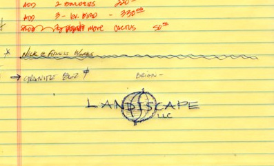
Here is the original customer provided doodle, two leaves in sort of a yin/yang format. It is a great concept, but it needs to be turned into a clean logo, and that is where the fun begins. Though the following images have 3-5 logo ideas on each, there were many more ideas that we aren’t showing here.
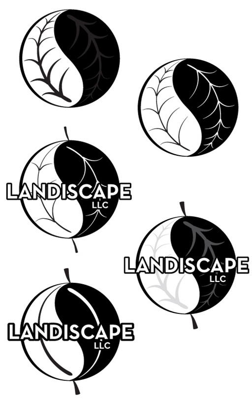
How many veins? How thick should they be? Are there veins and how will the text look over them? We start out in black and white as that is the least forgiving. Starting with color often results in a logo that doesn’t look very good, nor does it print well in black and white. Color makes logos look better than they really are.
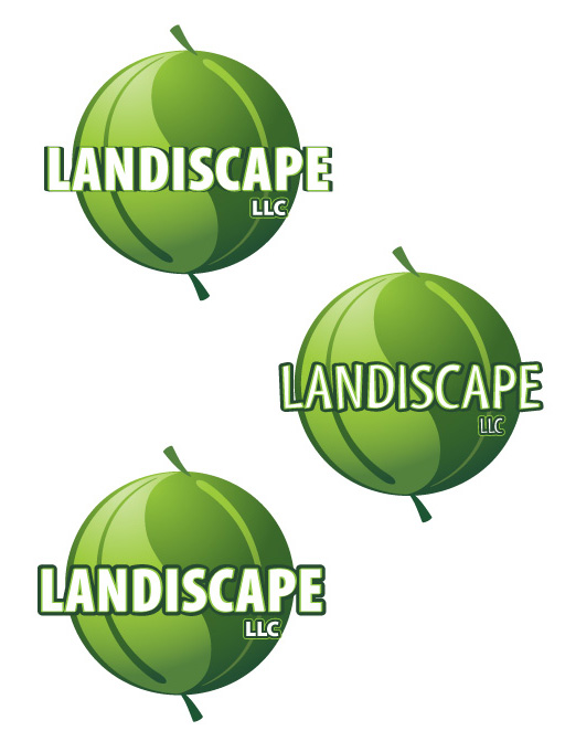
We tried a few block typefaces as they should stand out well when given a black outline.
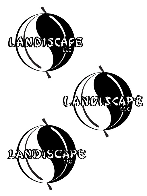
The customer requested some oriental looking typefaces [okay, pseudo oriental fonts] and we pulled out a few from the thousands we have. Many typefaces look great with a lot of characters, but when there are just a few, they can stand out like a sore thumb.
The simple leaves without a lot of veins is less busy and helps make the logo look like a sphere.
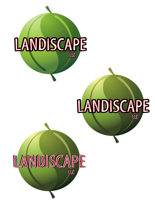
Since we were getting close, we started adding color. They asked for red and blacks, so we obliged. The bottom logo had the most promise, but it was too bold and the leaves didn’t fit well. None of the text applications are very readable.
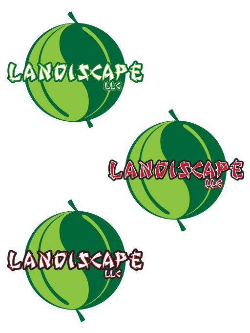
Dropping the black and red, and muting the greens and adding a gradient into the leaves. Now it is looking a bit softer and a bit more inviting.
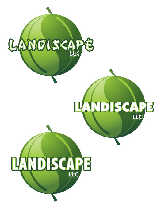
A few more typeface variations…
Then we get back to the black and red, which is a bit much. It is just too hard to read.
While playing around with the logo, we thought, “What if we roughed up the edges so that it looked more like leaves vs looking like a really nice melon or pea?” – it turned out to be a good idea.
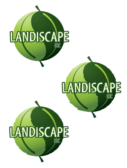
The client didn’t like the stems of the leaves, and he was right – it almost looked more like a balloon or melon. We tried a few variations.
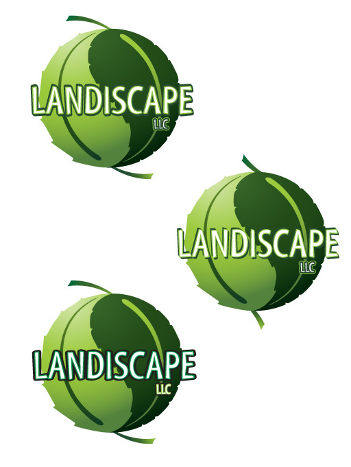
In the end, the client asked us to flatten the leaves just a bit, and that helped make the company name stand out a bit more. He was very happy about the logo and has been getting plenty of compliments, so that means we have done our job — making our clients look good.
