Category Archives: Invitations

Van Vuren Wedding Invitation and Program

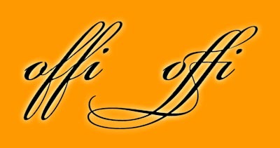
I enjoy the creation of wedding invitations not only because it is a wedding but because there is so little type which needs to be applied very well. Having a good design program that allows access to the special ligatures is a must. Ligatures create a special glyph to connect those letter combinations that look poorly together. Common ligatures would be the «fi» and «fl» glyphs. Adobe keeps a list of the potential creation of 4,281 glyphs which is amazing in itself. Don’t get me started on old style figures, small caps, swashes, ornaments, etc – access to these characters in a font is not going to be found in Office programs. I enjoy taking time to make sure the small details look great. The image below is what can be done with access to a quality font in with design software. Not only is it a better solution for the «fi» but a complete glyph for «ffi».

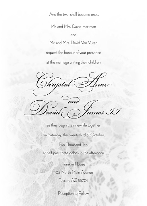
For the Van Vuren/Hartman wedding I went for classy and airy, slightly more than the «simple black dress» of wedding invites with that hint of lace texture. Very light and delicate.

The RSVP card matched well, and the there is a lovely grouping of swirls at the beginning. 

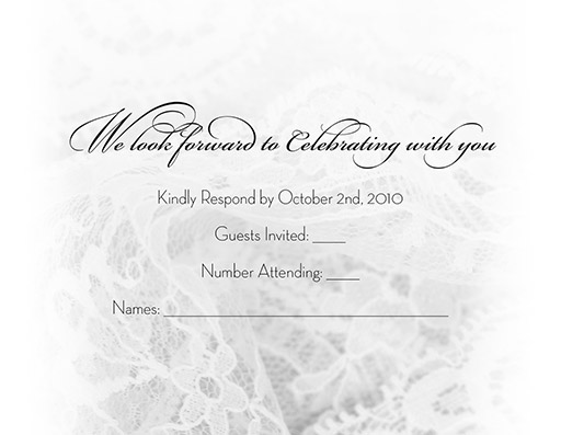
Clean and simple maps convey the area around the wedding.

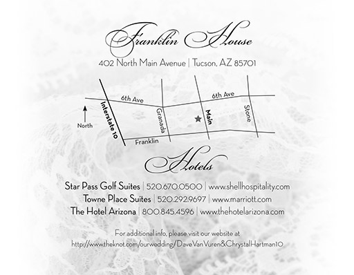
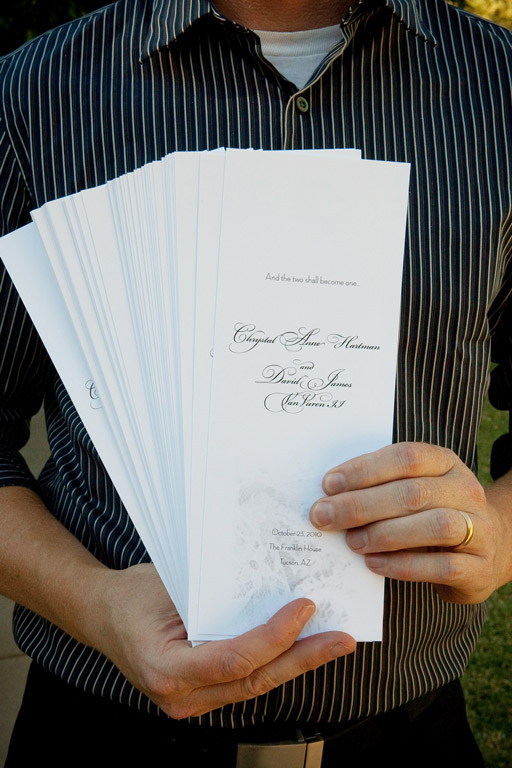
The wedding programs were larger to give them a bit more volume for the outdoor wedding. Printed on a thick matte paper, they would have doubled as great fans had the weather been warm.


Spring Fling After Party Card

The University of Arizona’s Spring Fling Carnival is the largest student-run carnival in the nation [probably in the world?] and has been a regular event for nearly 40 years.  I once won an inflatable airplane while playing roulette at one of the booths – I am sure you wanted to know that. The end of March through most of April is usually one of the best stretches of weather in Tucson with plenty of sponsorship walks and sporting events taking place.

Enough of the pitch for Tucson – here is a quick card for an after party in one of our local clubs. Rich colors, interesting type – an overall good looking piece. You need it, we design it.

Save the Date Postcard Design for Junior Achievement of Arizona

Someone once told me that Save the Date cards were created by designers and printing companies just so they could get more work -bwahahahaha – though they may be thinking of those wedding magazines as well. The bride just HAS to have water pulled from the middle of a Swiss glacier on her wedding day – anything else would just be a wedding Fail.

I say the real reason we need these early reminders is that our schedules fill up so quickly and we often leave out time for important things, such as this golf tournament for Junior Achievement of Arizona. This postcard design is fresh and green with a wide open sky, I would go even though I don’t play golf. It is a half sheet postcard with the logo distorted in Adobe Illustrator and dropped into Adobe Photoshop – not hard at all. It should be a card that is both eye-catching and easy to remember and will result in a greater turnout.

Event of the Century

How about some fun for your wedding? Time for the “Event of the Century” posters and cds. Michael and Jessica came up with that great idea to give to their wedding guests. I suppose Liz Taylor would have had to settle for “The Event of About Every 7 Years or So” — that doesn’t have the same ring to it. The first go around I mistakenly thought that their wanting to make the cd look like an old record album meant I was making it look like one, but who would have known there were blank cds out there that have the black vinyl grooves already created.

In the end, their event of the century was a success, which is what all of us really want.

Here is their movie poster…

…and cd cover…

…and the cd label that looks like a vinyl record that wasn’t needed…

…and the final cd label.