Tucson is well known as one of the best cycling communities in America. Pro cyclists [and triathletes] come to train here, and many move here for the year-round training that our weather provides. Well, we’ll take a ding for the summer, but you just need to get out early in the morning to get in your miles. The Perimeter Bicycling Association of America Inc. [based in Tucson] puts on several events each year, with November’s El Tour de Tucson being the largest. With about 9000 cyclists each year, there is a mix of top-level athletes as well as thousands that set the 108 mile event as there goal and spend the prior months getting into shape to reach that goal. Starting in August there are more and more cyclists out on the roads on the weekend, all in their brightly colored jerseys. Being a cyclist myself, I applaud everyone for making the effort to get into shape. Being healthy is a good thing.
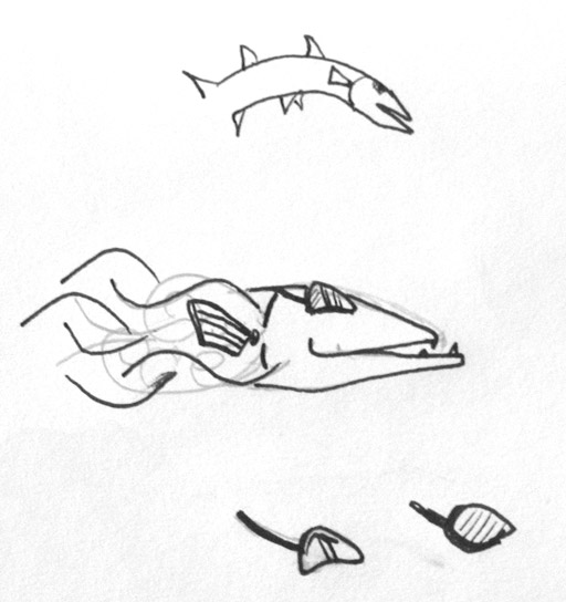
Starting with the Lance Armstrong poster in 1998, I have designed 6 El Tour de Tucson posters and 2 Tour de Phoenix posters. Some are painted traditionally, some have been done entirely on the computer, and the poster for 2006 was a bit more of a line drawing. Every year the process is mostly the same: work on coming up with some promising sketches, and once approved, complete the poster and then make modifications from there. I have always wanted to make some miniature cyclists riding on a cactus, so that is where I started, trying out a few color variations.
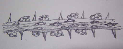
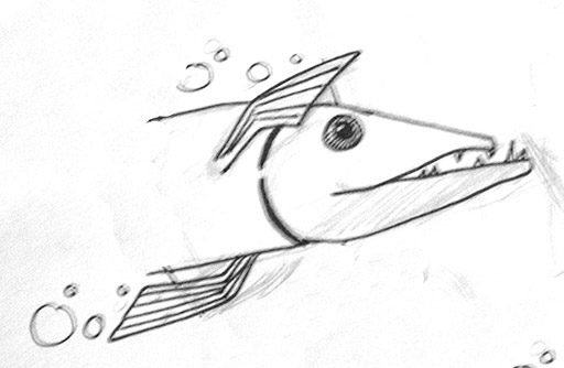
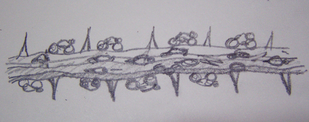
The colors seemed to be okay, but the sketches didn’t strike anyone as all that impressive, even though the thought was to paint the poster. That would be hard to mock up without completing the poster – far too many hours on the chance that it may be accepted. I moved on to pencil sketches for the composition and this was chosen — not a whole lot of detail. [click image for a higher resolution version]
Taking that sketch, I made a quick series of color mock-ups and I was given the green light to go ahead. As a side note, that is always a good thing to get, especially when there is not that much to look at.
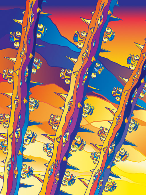
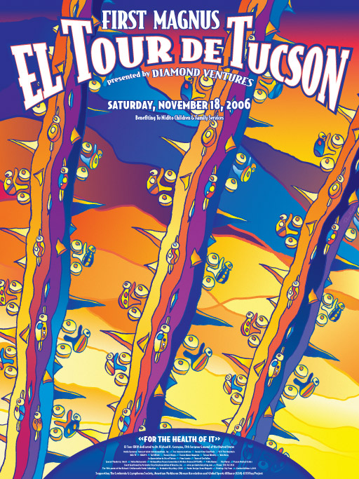
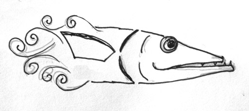
I redrew the branch and inked it in for a clean-but-rough line, scanned it in at a very high resolution and auto-traced it in Adobe Illustrator. Then came the fun of keeping the art to 5 spot colors and coming up with an attractive design [more on the 5 color limitation in a bit]. After a fair amount of work, 5 colors that worked well together were chosen and the artwork grew into a warm/sunlit side and a cooler shadow side. [click image for a higher resolution verison]
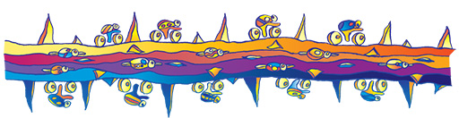
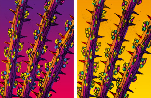
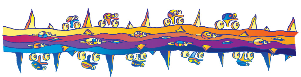
Here is an enlarged version of the nine cyclist bugs, which I also printed out as die-cut stickers on our large format printer. For the kids race, my kids had these stickers all over their bicycles and helmets. There is a bit of a petroglyph feel in these bugs.
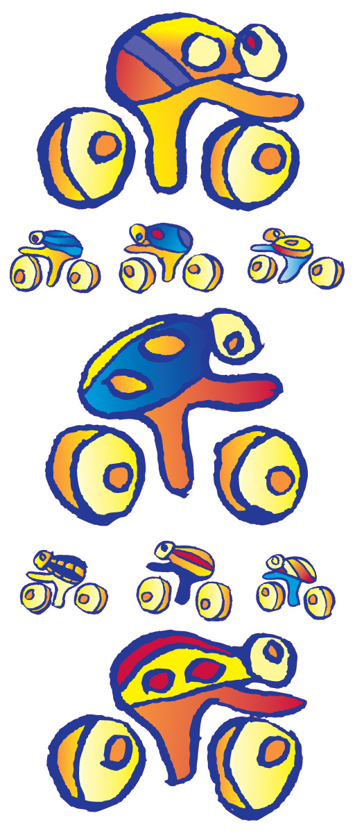
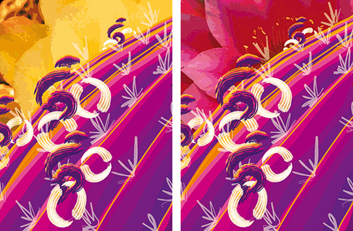
The mountains around Tucson were added with the same warm/cool color selection, and because of a time crunch all three branches were the same illustration with the branches recolored. That would be the one thing I would change if I had a chance: the branches and the bugs all needed to be unique. No two bugs alike. Ah well. Most people don’t realize they are all the same until I point it out [I am sorry if I ruined the magic].
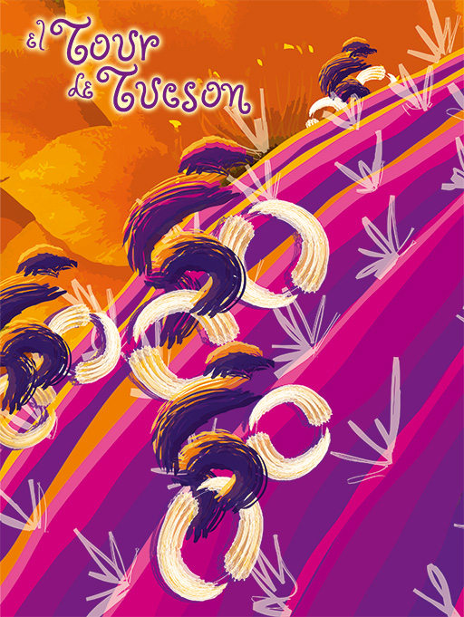
After several attempts to fit all the text on the poster in an attractive manner [I love my typography – I believe that is what sets my poster design apart from many of the other posters] I matched the curve in the text at the top with a blue notch at the bottom. It was a hit. But I wasn’t done…
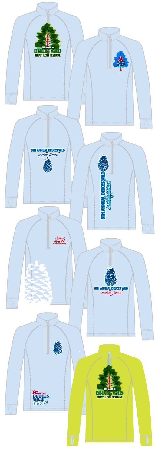
The El Tour folks needed the clothing to match the poster, which is why there was a 5 color limitation. Granted, I was allowed to blend the colors together which was probably a bit of a nightmare for the production artist at the clothing manufacturer. Several comps were created and this one was selected way back at the beginning of the process. Rough, but it was a good direction.
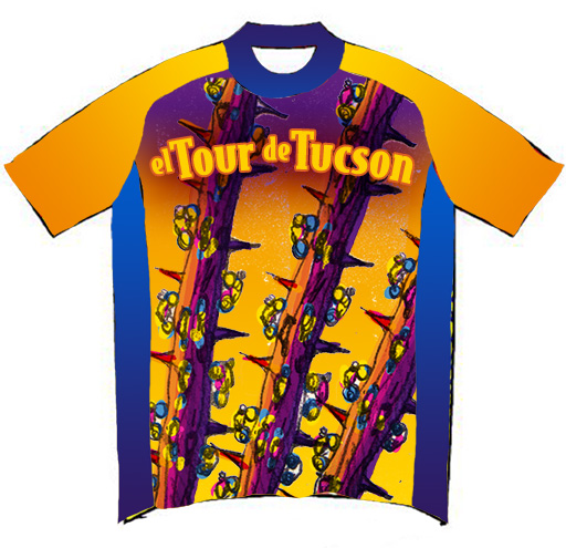
Once the poster was complete, the design had to be reworked to fit into all the different sized patterns. The mountains were too busy so they were dropped out and just the ocotillo branches and bugs were left.
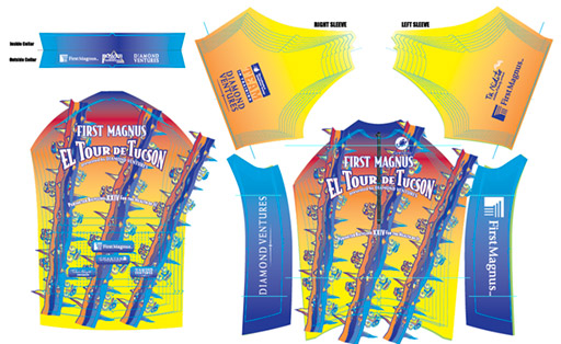
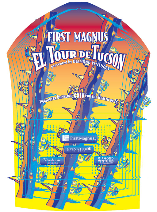
Here is a close up version of the jersey pattern. The art had to fit the smallest jersey as tightly as possible so that the text wouldn’t look like it was floating in the middle of branches and thorns. Pockets were taken into account, and on the front there was the issue of the zipper.
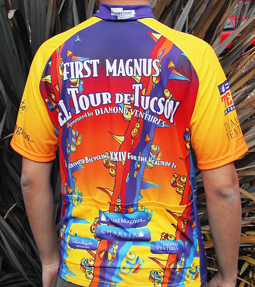
This shot was sent to us from Squadra, the clothing manufacturer. Jerseys, jackets, shorts, and socks were all part of the package — and they sold out, making it one of the most successful jerseys ever. That means I did my job — it was both an attractive design and a successful product for Perimeter Bicycling. As a bonus, I get to see my jerseys being worn all over town. They are most definitely bright and eye catching. [click on the image for a higher resolution version]


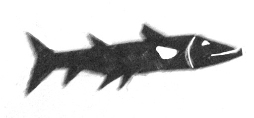
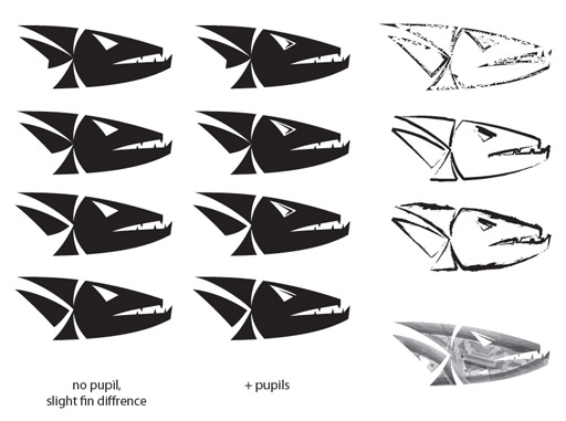
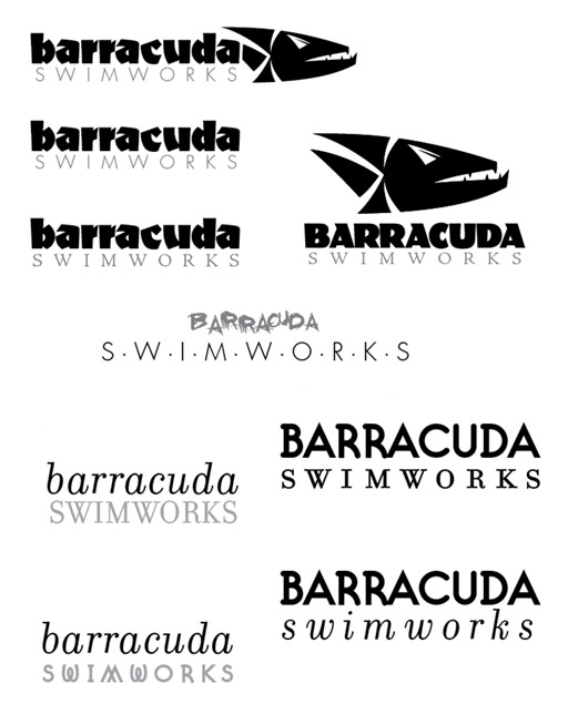
 A friend asked me to create a logo for her swim instruction, but her swim credentials are a bit higher: 4 time US National Champion [18 time US Nationals finalist], Olympic Silver Medalist, 3 time NCAA Champ and 4 time All-American. She won her first national championship at 13 [or was it 12?] and she has a
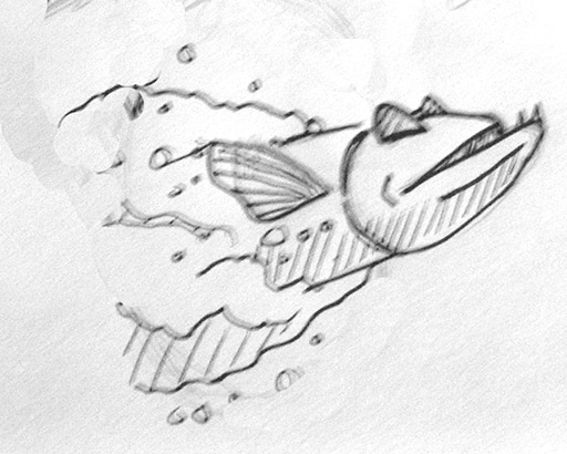


