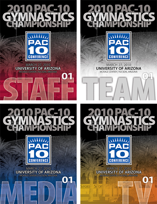
The Gymnastic Championships were held at the University of Arizona and they needed some attractive credentials. What is most difficult about designing them is making sure they both stand out and recognizable. That isn’t always easy when everyone will be wearing different colored clothing, and they stand out just fine when they are on a white piece of paper. Once they are dispersed to several hundred people, things change quickly. We went with a solid background with a bit of color at the bottom – that should have stood out rather well. Arizona did well, finishing 4th in the meet [the PAC-10 is always stacked] and they are headed off to Los Angeles for Nationals.

A peppy logo was required for a group wanting people to take a quick 10 minutes after a church event to come meet a few of the people that had just been lecturing. The yellow and orange version was good, but the 2nd logo had a lot more energy.


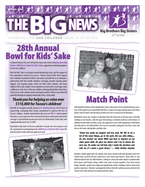
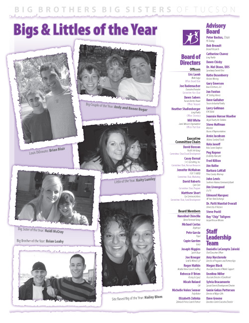
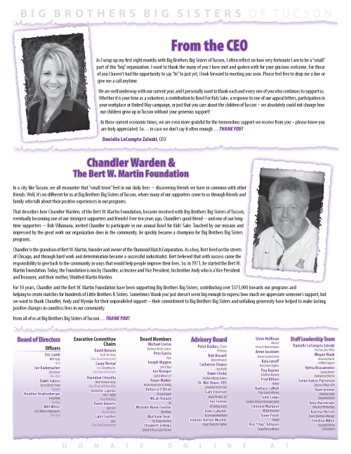
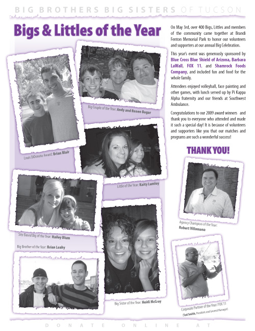
Big Brothers Big Sisters of Tucson was looking for something new for their newsletters and other printed material. We came up with a unique solution utilizing their national logo and some soft shadows on a rough edge. Designing with a limited color palette [black and purple] is always a nice challenge compared to working in full color. It is economically wiser as well, and the result is eye catching.
If you have ever wondered about become a big brother or big sister, contact them – they are a great organization that is fulfilling a great need. You may be surprised how much you will enjoy it.

Of course, there were several options. The next page below was a great design but it didn’t work for the order of the articles.

The image below is what was printed, and it has done well in this newsletter as well as later issues. If you would like, you can download the newsletters from the BBBS page here.


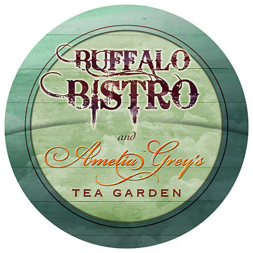
Annette Hartman Catering moved into Copper Country Antiques store and fired the Buffalo Bistro back up. Phenomenal food [just wait for the mesquite grilled tri-tip] and great people, they needed a new look to match the new feel of the bistro. They also needed signs for the Bistro – round signs. After this project, we believe more people should have round signs.

Graphic Design and Illustration Portfolio
