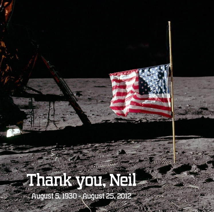
This just about says it all, though I will quote from the book “Rocket Men” referring to those that have gone into space:
“They have something, a sort of wild look. I would say, as if they had fallen in love with a mystery up there, sort of as if they haven’t got their feet back on the ground, as if they regret having come back to us… a rage at having come back to earth….. did you know that for months [they] went around looking at the sky? You could speak to them and they didn’t answer, you could touch them on the shoulder and they didn’t notice; their only contact with the world was a dazed, absent, happy smile. They smiled at everything and everybody, and they were always tripping over things. They kept tripping over things because they never had their eyes on the ground.”

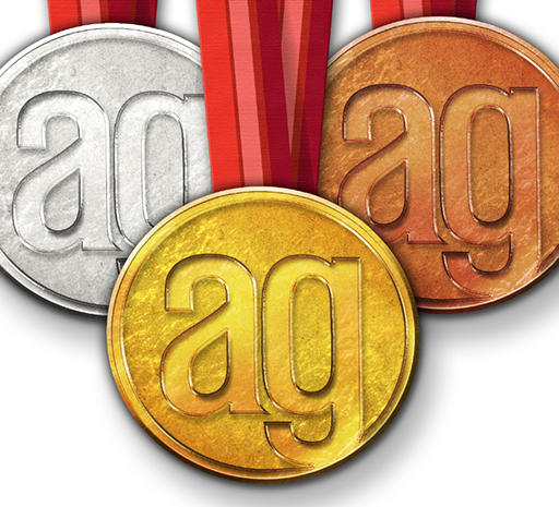
Gold medal design left on the blocks
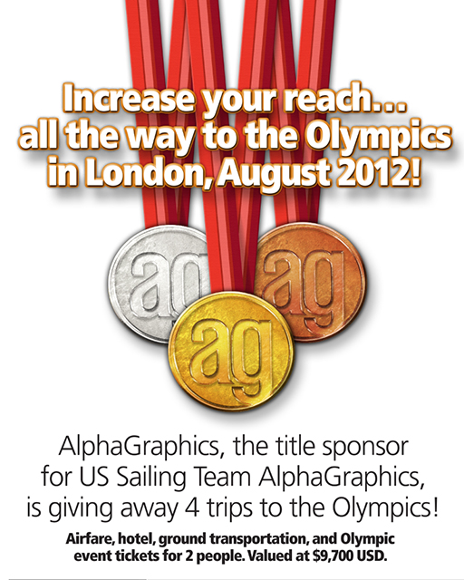
All AlphaGraphics are owned by franchisees, with the AlphaGraphics headquarters in Salt Lake City [though it was founded in Tucson], and there was a great promotion planned for a trip to the Olympics. After going ’round and ’round on getting the franchisees to buy in, the promotion never got off the blocks though it did hear the gun. The final design of the medals were beautiful, with a nice cloth texture for the ribbons. Are we allowed to give ourselves a medal for what is literally a gold medal design? Yes we can. Leading up to this design were several comps in Adobe Illustrator to get the composition fine tuned before pulling it into Adobe Photoshop to build the 3D portions and add the textures.

The following promotion never happened, though I wish it did, and I wish I could have won it. I’ll have to settle for winning the VISA contest instead.

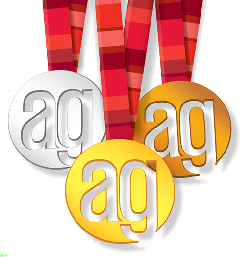
Here are some of the ideas for the composition of the final piece.


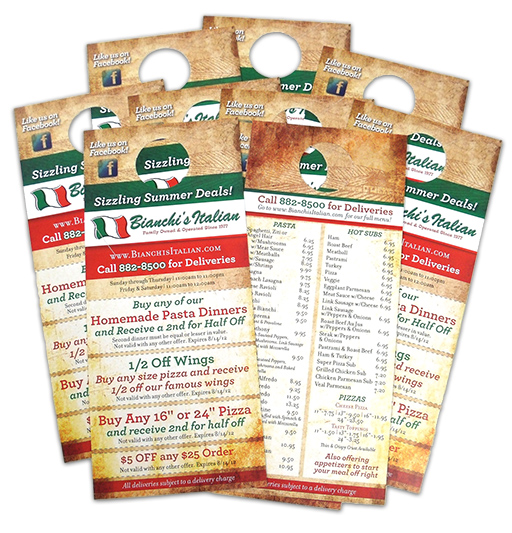
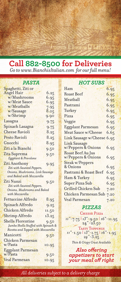
Bianchi’s Italian canvassed the neighborhoods near them with door hangers we designed and produced for them. It needed to be eye-catching and it had to hold a lot of information. Bianchi’s is another Tucson original, first opening in 1977 and now run by their son. Using some earthy imagery evoking old Italy and sharp use of the green/white/red of the Italian flag resulted in an attractive door-hanger. Each coupon is readable at a quick glance. Just looking at it makes me want some garlic bread for a mid-afternoon snack.


Graphic Design and Illustration Portfolio
