Brochure Redesign and Self Published book Design

It happens more often than we would like to think – “I had this designed elsewhere, but I don’t like how it turned out”. Just because someone or someplace has a computer and software [in this case, Word] it does not mean that the result will be professional design. I’ll hit on this some other day, but when I had my kitchen redone, I did not build my own kitchen cabinets. There is a reason we have professionals. I’ll climb down from my soapbox though I do feel bad for people that get burned.

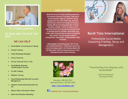
I’ll start with the redesign – clean, bright, inviting and relaxing. The blues capitalize on the various social media icons that are blue [more about that further below] and it helps make Bardi the focus of the brochure. Click on the images for a larger image.

Did I mention this was done in a time crunch as well? It was just under a 3 hour job, including stripping out the images from the provided Word doc, masking out images and formatting. See, speed DOES matter. Just think what it would look like if I had 20 hours to work with…

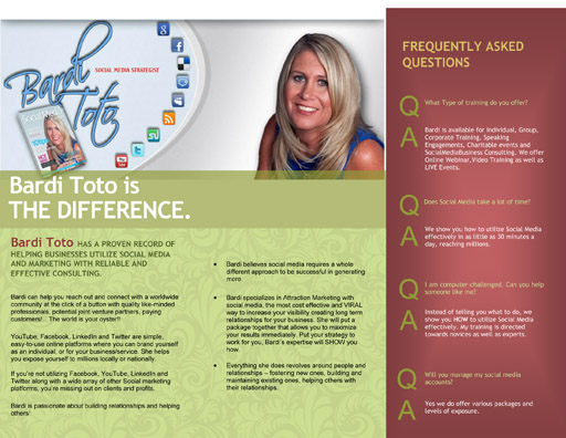
Below are images of the provided artwork. Blocks of color with little flavor, text without any flavor, though I kept the basic layout as that was fine with the client.

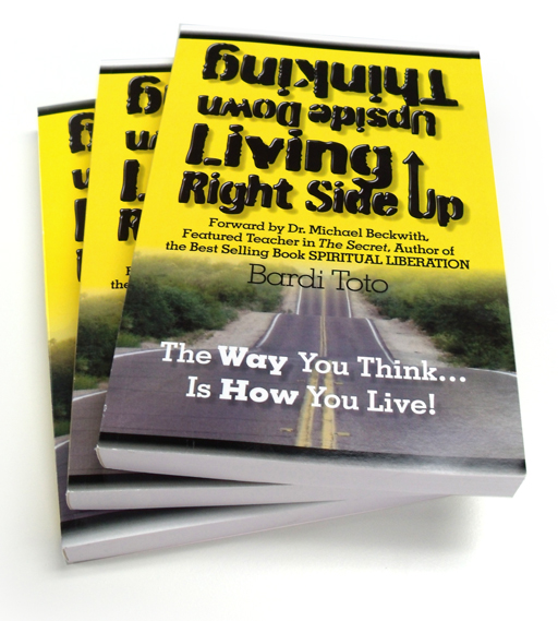
After this project, our book design services were utilized in the form of a 240 page book that needed to be laid out and prepped for printing first with us and then through Amazon. The cover came to us with this design but it was also a bit flat.

I still had several photos I had taken early one morning for another project, and the rolling hills worked great for the image beneath the title. I also moved the cover from being a list of information to something more dynamic and identifiable.


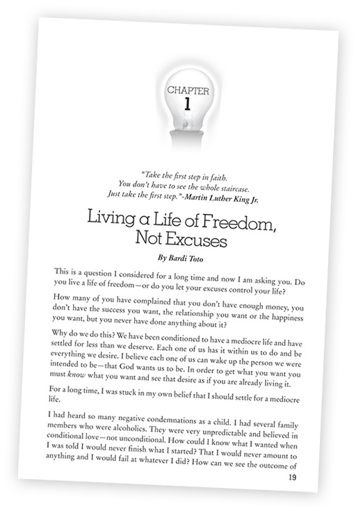
Formatting the inside of the book took a bit longer as any well formatted project should. I always take the time to create style sheets so that I can change any aspect of the book in a moment. Need the text larger? Done. Need a different font? Done. The light bulb was a nice touch to break up the chapters.

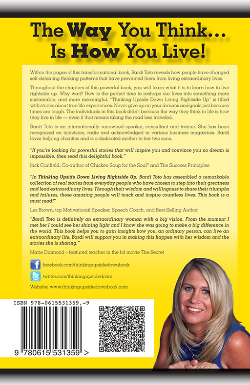
You may look through more pages at the Amazon.com listing here, and you could purchase it as well.

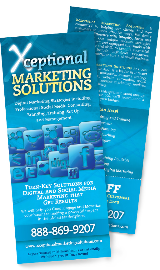
Last in the list of items came several months later in the form of a quick handout/rack card. I pulled all the social media logos I could find and piled them in an attractive manner, keeping with the blue from the first brochure. The variations of pale yellow and white on the blue helped form a sense of urgency which was what this call to action piece was to be about.

Our last championship was in what year, 2007?

Every year I try to mix up the look and feel of the artwork for the pieces I get to work on for the Athletic Department. This year I went old school for that great trading card look. Now that we are entering the championship tournament, it is hard to believe that the University of Arizona softball team has not won a national championship since 2007. Really. 2007. That seems like forever ago, considering how often we make the finals and/or win the national championship. I dug in the archives to find the first credential I designed for the University of Arizona. I think Arizona could go for some more celebration as seen in that background photo. Then there could be some Arizona Baseball celebration in the wings as well, maybe some Kurt Heyer in the major leagues as well.

First up, the credential from 2008.

And then our current season of images. Arizona baseball and softball have a long history with the national championships.

Oh yes, there was a renunion going on for Opening Day in the old Toros ballpark. My dad played baseball and softball until he couldn’t [and coached for years] and my uncle played for the University of Arizona. Ah, history. Click on the image for a larger version.

Six Banner Stands for Conference Registration

The Carondelet foundation needed six banner stands that would be easy to read behind the registration tables. We could make nice banners, but one must always consider the restrictions: tables covering the bottom half of the banners, people sitting in front of the banners – sometimes standing] and a lot of people milling around. This makes for a very visually-busy area. Practical solution: bright colors at the top that are easy to read and then imagery that will stand out in a crowd [literally] while still remaining very attractive. Using a handful of photos provided by one of the doctors, these six banners will look great for registration as well as calling people to the correct tables. They were also all produced by us, which is always great for our clients. We like to keep the production of all our work under one roof.

And then all 5 of the registration table images side to side. Though we produced all of them in-house, we didn’t assemble all of them for a photo op [sorry]. Click on the image to see it larger.

Pima Air and Space Museum Wright Brother’s Exhibit Design

Pima Air and Space Museum had a full size replica of the Wright Flyer with a stack of old photos and were needing the museum graphics designed for their exhibit. This project was thoroughly enjoyable from beginning to end. A museum exhibit? In my family, every vacation had us stopping at state and national parks along the way, with extra stops at pretty much any museum we could find. Did you know there is a firehouse museum in downtown San Diego? Sure, everyone else goes to San Diego for the beaches… okay, back to the story. The great guys over at PASM had already designed the stand to hold the aircraft, and I needed to create the graphics to showcase the aircraft. It stands just inside the main doors to the exhibits, the first plane you will see when you walk in. What better imagery to use than the plane just lifting into the air in the middle of the dunes, two brothers out to prove that man could fly. Colorize it a bit to warm it up and it became a wonderful centerpiece to the exhibit.

Their story and photos complete the rest of the exhibit, all with a scratchy background of antique paper and imagery. Below is the rear of the exhibit with a copy of the motor used as well as a cross section of the wing to help explain how the brothers turned their plane by warping the wings.

Part of the exhibit on the left hand side, presumably for reconditioning.