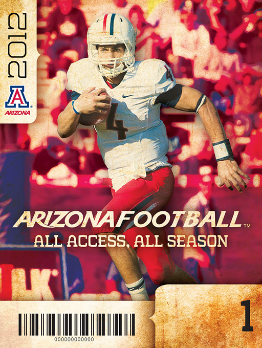
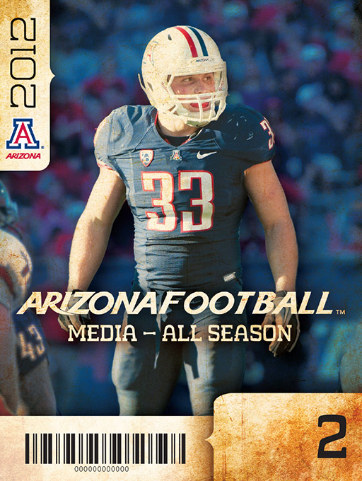
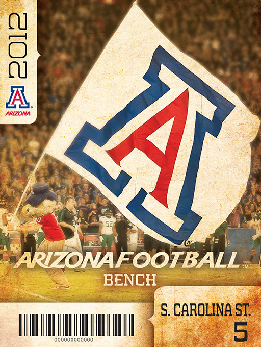
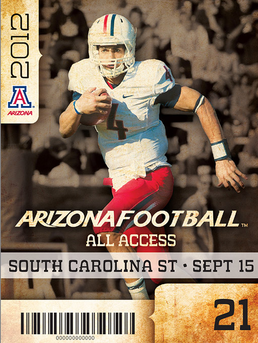
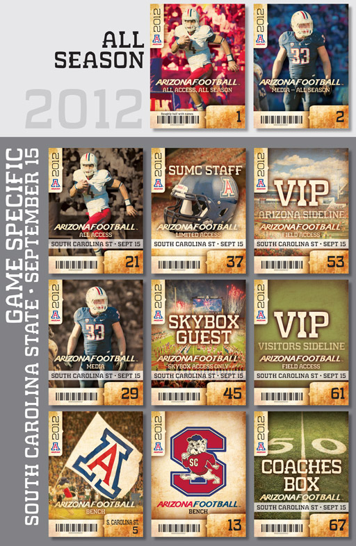
Here are the designs for the rustic themed football credentials for this year. The main passes were modified to have unique colored backgrounds, blurred just a bit [no, Instagram was not used] and the main Photoshop file was a bit light this year, weighing in with just 84 layers. Along with the colorized backgrounds and other modifications, a subtle shadow was added to the interior of each athlete to add emphasis.
To answer the frequent question of “Why do you make them so attractive? They are only credentials,” I believe that every item should look as attractive as possible within the constrains of time and budget. I would hope that everyone receiving one of these credentials thinks, “Wow, this athletics department is top-notch.” I have heard of plenty of people keeping their credentials – they need to be THAT attractive. I’m just playing my part of making what I get to touch a bit more attractive.
The entire set is below, and continue on to see larger images further below.
[Most likely boring production specs]: Dozens of all season and game specific backgrounds were set 1-up in InDesign, merged with the unique barcodes and other information with our large variable data package resulting in one large file that was set to cut and stack. Programming to set it up took a bit more time with 2 additional home games and it resulted in one very easy file to produce – that makes the rest of production very happy.