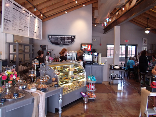
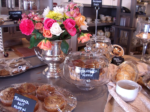
There are benefits to being a designer within a larger business, and most of those benefits can be directly realized by our clients. Maybe you have been there — taking your logo to a handful of businesses to get different items produced, dealing with people not having the right software, color problems, and explaining everything repeatedly. And in the end, you hope that all the pieces work together. That doesn’t have to happen as we produce a wide range of products in-house. Design, yes, and printing and copying — those are a given most everywhere. When Amelia Grey’s Cafe & Catering was preparing to open, we covered a bit more than just those three. The photo below? We did none of that though is does make the mouth water.
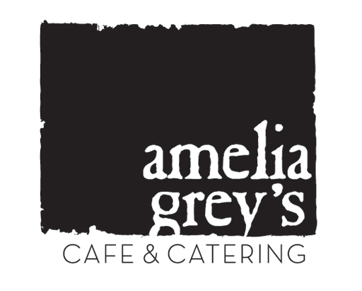
We started off with two logos, one for the cafe and then another for their catering business. After dozens of ideas, the large block for Amelia Grey’s would make a great mark that would be memorable as well as the pairing of two typefaces that play well together. For the catering it was a bit more classy, almost modern nouveau but not exactly. So step one [at least on our end] was complete – on to the rest of the necessary items.

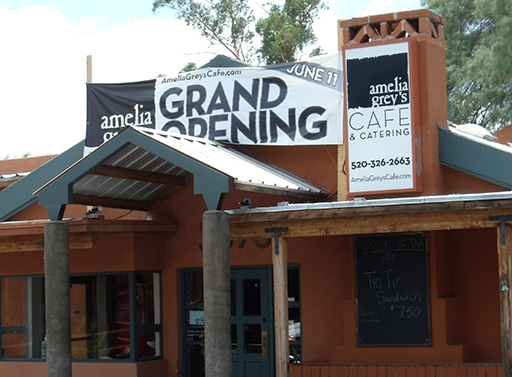
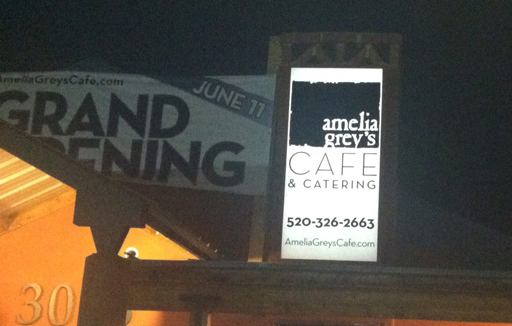
We do large format printing, so the Grand Opening banner needed to be up to promote the new business, and we do cut vinyl as well, so we replaced the previous back-lit signs as well. That saved a trip to the sign company, seeing how it was all done in-house. What isn’t shown are two more street-side backlit signs, and if you look real close in the image below you can barely make out the cut vinyl logo and hours in the window — we do those too.
You can’t sell food without a menu, so that was next. We produced them as well and they are shown sitting in a homey basket below.
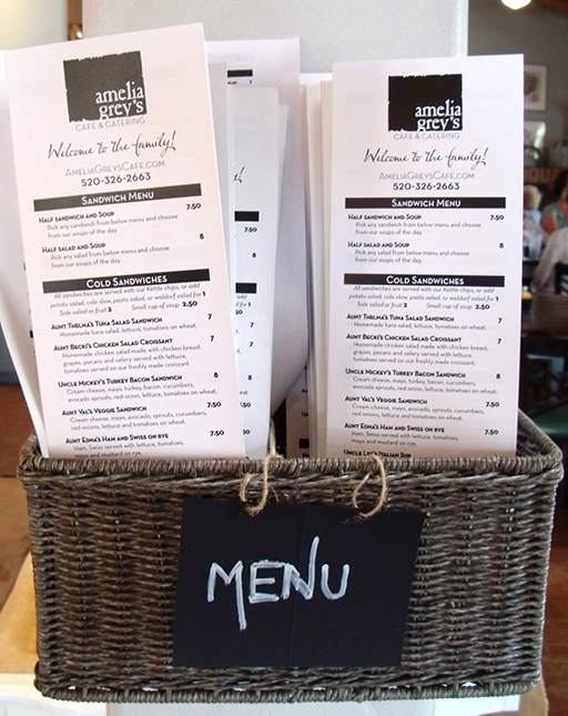
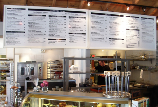
There was a fair amount of time to get that menu to both flow and be legible on the menu boards and they came out great. Most anyone standing in line can easily read the menu.
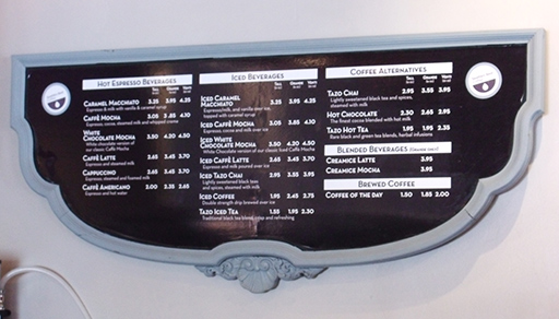
There was also the coffee menu, which was put on an old inverted head board which has great style on its own.
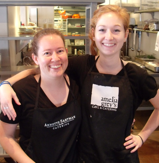
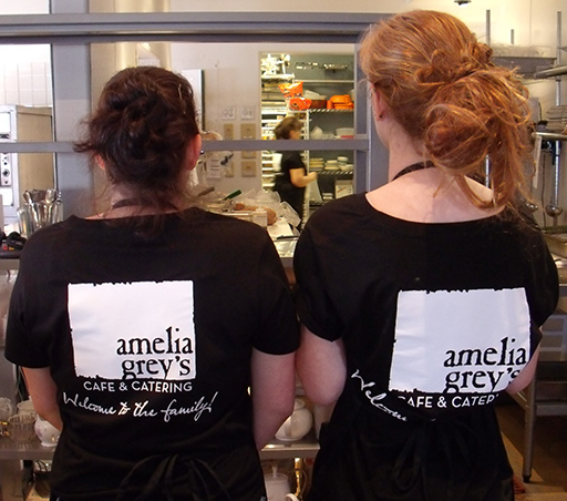
Shirts and aprons? We can print on those as well, with Amelia Grey’s shirts and aprons with each of the logos on them, depending on the event.
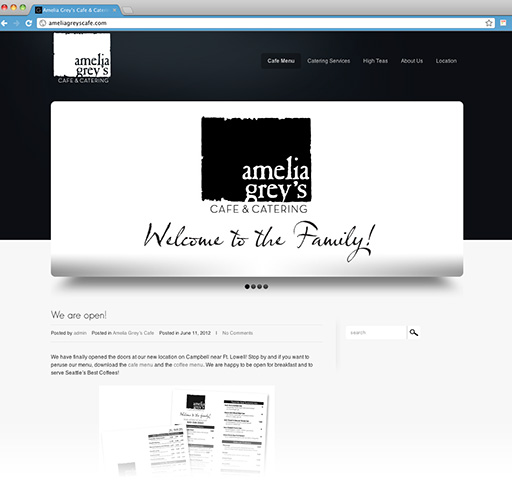
I am still working on the website — now the cafe is open and serving customers, there are a lot more photos to put up as well as setting up the online ordering for their catering services. It’ll be dolled up soon, and the online ordering should be helpful.
What else? Labels for the food packaging [little round ones to close up the packaging and on the sandwich paper, as well as for label fights], business cards and soon to be invoices along with other promotional material. Go visit them at AmeliaGreysCafe.com. Better yet, head over there for a High Tea or for lunch. Welcome to Tucson, Amelia Grey’s Cafe & Catering — local businesses are good businesses!