The Santa Cruz Community Foundation needed a look unique to its location though it still remains an affiliate of the Community Foundation for Southern Arizona. What we came up with was a soft, warm brochure that pulls towards Santa Cruz County, especially now in November with the golden sunsets and long shadows crossing the high deserts up to the mountains.
They are a great group of people – go check them out, and check out a pdf of the brochure.
2011 Calendar
This is our twelfth year of making a calendar for ourselves, and we have been filling them with silly dates and events. Do you remember when Google launched GoogleCountry and took over much of South America, or when the Niña and the Pinta called shirts in 1492 and the Santa Maria was not happy about being “skins” for 2 months? Ah, those were the days…
This year we chose a different tack. The last few years have not been easy on many of our clients both local and around the world. We’ve all had to cut back and be a bit more purposeful and wise. That is why we have centered this year’s calendar on mankind’s 50 years of man in space, beginning with Yuri Gagarin being the first in space on April 12th, 1961. It isn’t a big jump to put these hard years together with getting humans into space. It would be an understatement to say there was a lot of hard work and effort put in by hundreds of thousands to get people into space. And that is exactly it — we’ve done it before, and we can do it again. Sure, there is no easy answer to all of this, but at least we can all put our noses to the grindstone and crank out the best we can do. With that spirit in mind, this calendar is for all of us that will be giving it our best shot, with long hours, dedication, ingenuity and hopefully some wisdom.
If you would like a calendar [and you are in Tucson] drop us a line and we’ll work on getting a calendar out to your workplace. We’ll bring extras, just in case anyone you work with wants one [or you can just take one and become the envy of your coworkers – that would be our choice].
If you don’t want to wait, here is a pdf of the calendar that you can print out, though it isn’t very legible on an 8.5×11 sheet.
Click here for a larger jpeg, though you still won’t be able to read the date. If only our year had fewer days…
Closed Sign
You may be thinking «what is the big deal about a closed sign» but how could anyone not be happy to be CLOSED for a few days? I’ll be hanging out with family and taking a break from designing for a bit, which results in better design in the following weeks. The turkey is a quick doodle, and it reminds me of all those cut paper crafts from elementary school. I know it is a bit late, but you can download the pdf if you would like.
Download the wallpaper of your choice and keep watching and supporting our olympians.
Las Montañas Apartment Map
While looking for another file I came across an apartment map from several years back. It was made to be both handed out and as a large poster for the office. Not only is it functional but it is also attractive. We’ve all received maps for hotels or other places and have gotten totally lost. This map does its job well. Now I want to go did up all the other property maps we have done just to compare [and share].
Click here for a pdf of the map.
Realtor Kate Ryan
Kate Ryan is another realtor that does a great job selling, and she represents some beautiful homes. Homes this attractive would seem to sell themselves, but a flyer that could easily be place as an ad in Tucson Lifestyle magazine helps as well. The final back side was different, but the white on black was a beautiful touch. Gorgeous homes, and a flyer to match.
Paragon Poster
Many times the role of a graphic designer is to take a handful of images and put them together to make a good looking piece. Is somewhat MacGyver-ish in the way he would take a plastic fork, some string and a cardboard box and create an armored tank. Thankfully we had better images to work with than a cardboard box, and who can go wrong with NASA related items?
Rebecca Maher Realty
For a while, it seemed as if everyone and their uncle were either realtors or loan officers – that is, until the market turned a bit sour. Those that were the best survived, and Rebecca is definitely one of them. It used to be that one could write a phone number on a sticky note and put it on the door of a house and it would be sold before the day is out. Now we have to do a bit more than that, and good looking flyers, signs and business cards are very helpful. We worked on a new look for Rebecca’s material, going with a fresh look and peppy colors.
The 2 following images are to her postcards.
Every home requires a good looking sign as well…
and don’t forget the business cards.
Every property gets the same treatment.
’09 Football Credentials
With the credentials for 2010 wrapped up and in production, we can now show you last year’s credentials. We take security very seriously and didn’t want to take the chance of the 2010 credentials looking even remotely similar as to 2009. BUT, you really must attend a game this year and check out the 2010 versions as they are going to be great.
This all goes back to our desire to not just make good design but to make everyone else look good as well. We want the athletic department to look good, that people coming from other schools to a game and being given a credential will look at it and think, «whoa, this school is top notch». Granted, we take on all kinds of design work and we try hard to make everything we touch look good, but this is also our hometown team – we take pride in what we can do to help out.
Included below are a few of the dozens of credentials we create for each game, as well as a few large versions of the credentials without the required text. They would make for a nice set of playing cards.
Maybe we should be a bit more impartial, but having a UCLA player being bowled over on their head — it makes us smile.
El Tour de Tucson Poster & Jersey Submission
We were asked to come up with an El Tour de Tucson poster/jersey idea as they already had a few submissions and wanted another artist to submit another option. Unfortunately, less then a week was given so this was done outside of work hours to afford more time, which there still wasn’t a whole lot. It wasn’t anyones fault — sometimes the process is longer than the time given. These were two ideas, but where never completely finished due to time constraints.
Idea #1, including the Pima County Courthouse [the old one, that is] and saguaro ribs in the background. Where to put the cyclists? Not totally sure, but either riding in front [very dynamic] or around the dome.
Idea #2: a much stronger composition for the poster, with the riders leaving the old Pima County Courthouse and the 7am sunrise in the background. With the sun on the far side, deeper colors in shadow could be used with a few lighter colored highlights.
Here is a quick color mock-up of the second idea, with deep blue/purple shadows.
Another quick mockup of the poster so that we could pull the graphics over to the jersey.
… and another version in green.
The final poster would have been painted, and the 5 spot color restriction for the clothing would be removed.
A good cycling jersey always complements the poster, though the printing restrictions keep it from getting all-out crazy. This version matched the border of the Pima County Courthouse’s dome, and looks a bit more southwest.
We don’t believe we have ever seen a blue and purple jersey – it just might work.
The jerseys are printed with 5 spot colors, and the last few years the colors have been somewhat similar. This was a sizable jump from prior year’s colors.
Landiscape logo, the creative process from doodle to finished design
Ever wonder how a logo is created? We can assure you that it is never done on the first try. All those great logos that we see every day – they took several revisions [and for big companies, years] until the right look is found. Follow along as we go through the logo process for Landiscapes, LLC.
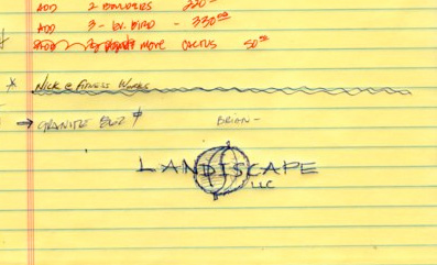
Here is the original customer provided doodle, two leaves in sort of a yin/yang format. It is a great concept, but it needs to be turned into a clean logo, and that is where the fun begins. Though the following images have 3-5 logo ideas on each, there were many more ideas that we aren’t showing here.
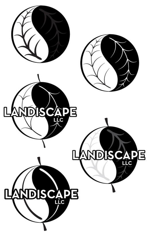
How many veins? How thick should they be? Are there veins and how will the text look over them? We start out in black and white as that is the least forgiving. Starting with color often results in a logo that doesn’t look very good, nor does it print well in black and white. Color makes logos look better than they really are.
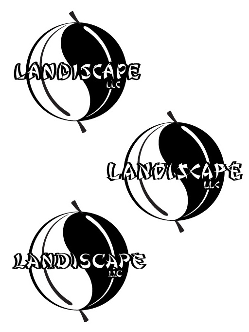
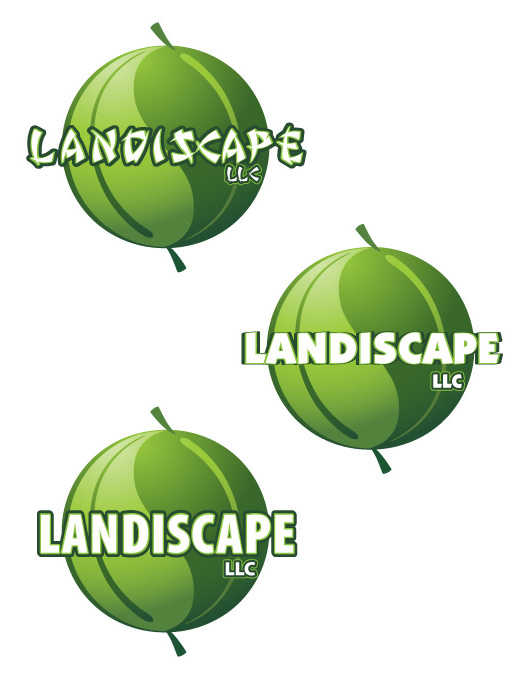
We tried a few block typefaces as they should stand out well when given a black outline.
The customer requested some oriental looking typefaces [okay, pseudo oriental fonts] and we pulled out a few from the thousands we have. Many typefaces look great with a lot of characters, but when there are just a few, they can stand out like a sore thumb.
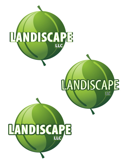
The simple leaves without a lot of veins is less busy and helps make the logo look like a sphere.
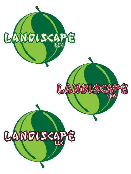
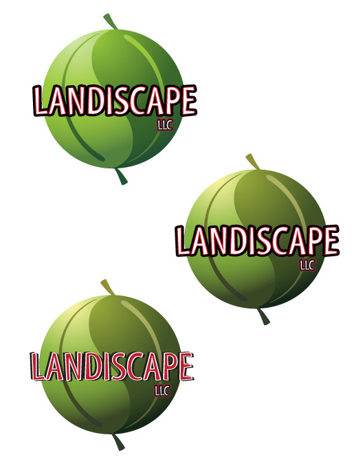
Since we were getting close, we started adding color. They asked for red and blacks, so we obliged. The bottom logo had the most promise, but it was too bold and the leaves didn’t fit well. None of the text applications are very readable.
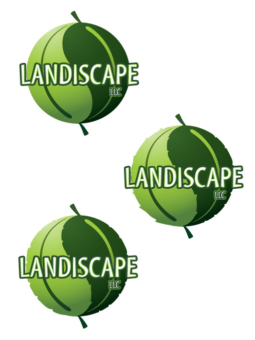
Dropping the black and red, and muting the greens and adding a gradient into the leaves. Now it is looking a bit softer and a bit more inviting.
A few more typeface variations…
Then we get back to the black and red, which is a bit much. It is just too hard to read.
While playing around with the logo, we thought, “What if we roughed up the edges so that it looked more like leaves vs looking like a really nice melon or pea?” – it turned out to be a good idea.
The client didn’t like the stems of the leaves, and he was right – it almost looked more like a balloon or melon. We tried a few variations.
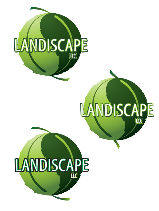
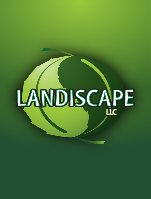
In the end, the client asked us to flatten the leaves just a bit, and that helped make the company name stand out a bit more. He was very happy about the logo and has been getting plenty of compliments, so that means we have done our job — making our clients look good.