Deuces Wild Triathlon Festival Clothing

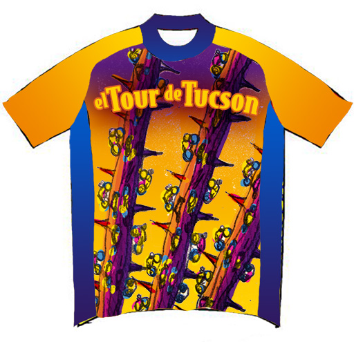
Every year the people over at put on a series of races in Show Low, Arizona as the Deuces Wild Triathlon Festival. Not only is it a great chance to head to the mountains, but all the proceeds head to charity. As with most large races, every entrant receives a race shirt of some kind, and these shirts are not just a t-shirt [anyone that runs in a t-shirt knows they are not “sweat-friendly”].

This year, the process began 6 months in advance, with a choice of one of the many colors of fabric that the manufacturer provided. At least we started with a sky blue. Where we finished… well, you’ll see.

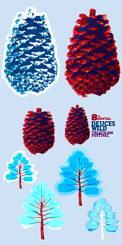
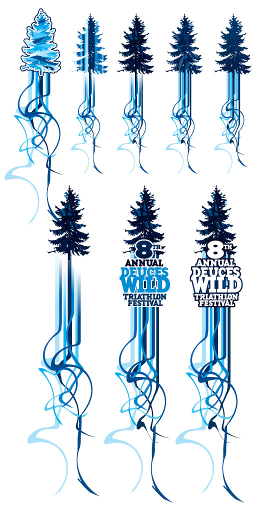
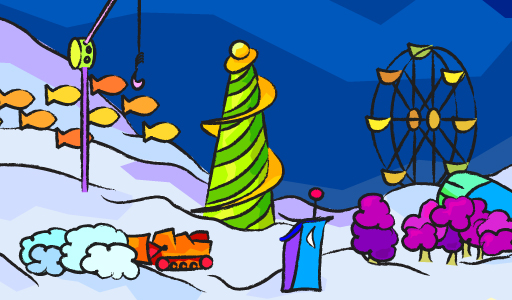
Pine cones and trees were the requested imagery, getting away from the infamous Club from the playing card that gave the town of Show Low its name. Though the pine cones were attractive, the tree struggled a bit.

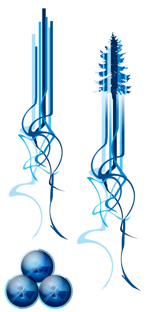
Plenty of mockups ensued, even trying another color to see if would help the tree pop a bit better. They tended to look a bit wintery.

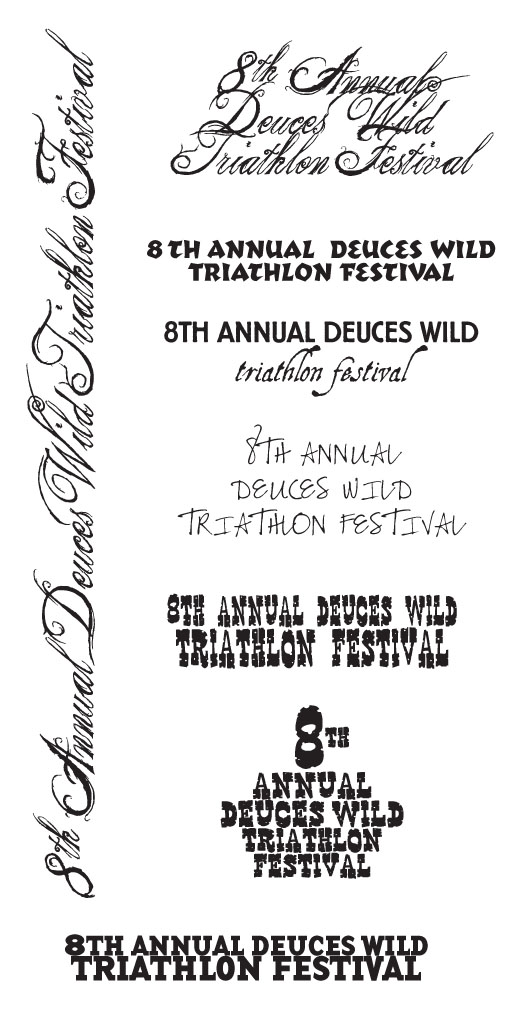
Dozens of typefaces are chosen from the many thousands we have, and the beginnings of a path to something attractive is started.

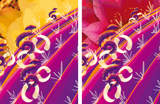
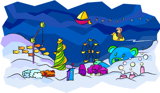
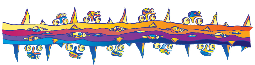
The original trees were scrapped fo one with more detail, and blue racing stripes were included. At the bottom are 3 spheres [similar to what would normally make up the Club] which was a happy accident.

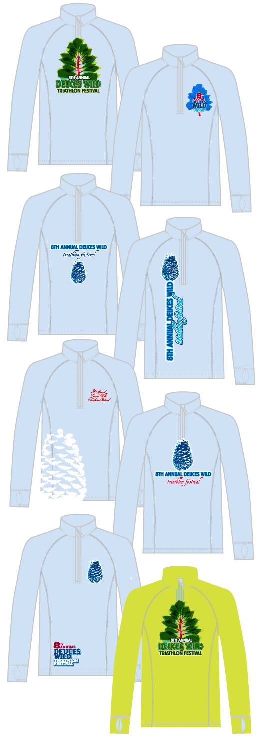
The direction of the blue trees with the swirling ribbons was approved, and that resulted in several more versions, with the text added near the end. Some trees were lacking in contrast, while the first two just didn’t have much punch.

Too much blue! Time for some other colors, and after the samples were passed around some of the staff, the ribbons were referred to as being too feminine. Chips taken out of the ribbon along with hotter colors was the fix.

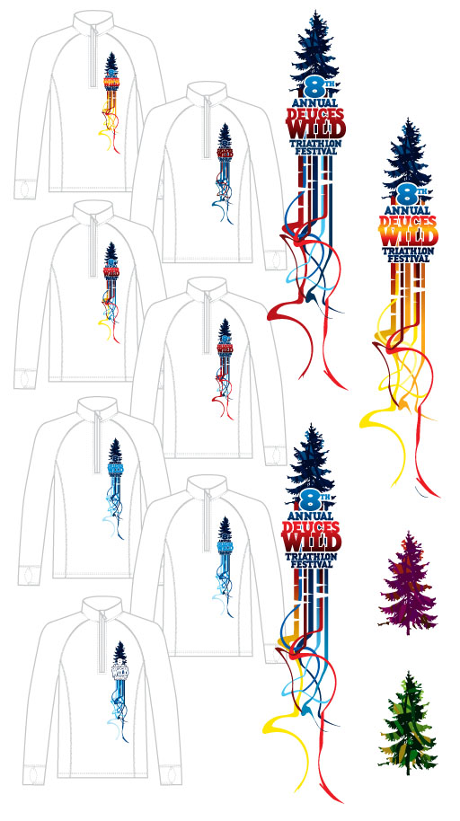
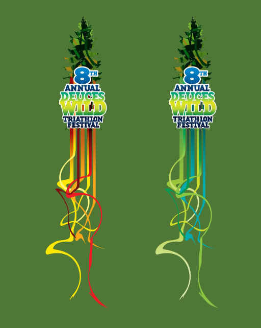
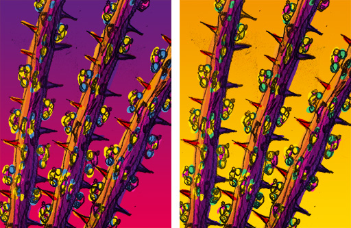
The blue fabric was given the boot and a chile color was chosen. Both the green/yellow and blue/red combinations looked good on the color.

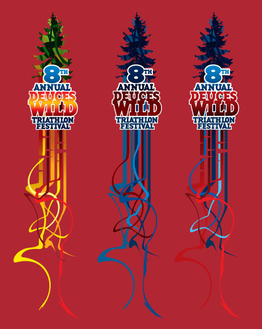
With the production time to get thousands of shirts done before the race getting shorter and shorter, it turns out that the manufacturer did not have enough chile fabric. Two other colors were chosen, both workable, and the yellow [manly] ribbons looked good as it faded into the yellow shirt at the bottom.

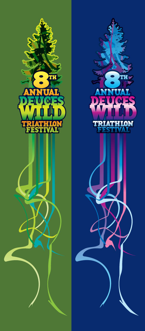
Not enough of that material either [and remember, this is special sweat-wicking material, too]. They had plenty of moss green, though, and once the cuts in the ribbons were removed, the green/blue/yellow version was approved.

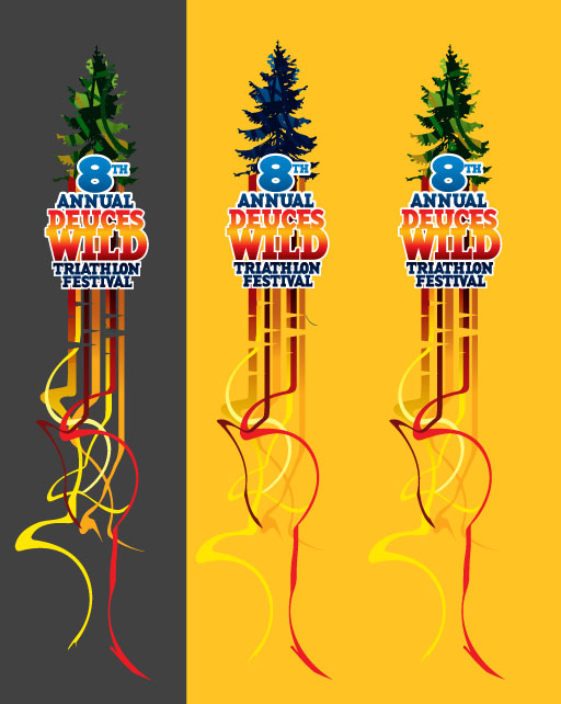
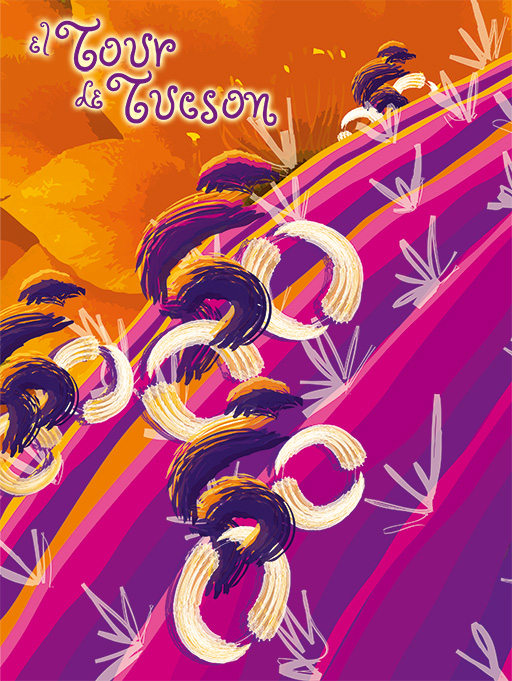
ALMOST approved — they were just short of moss so a midnight blue for the women was chosen, and the green/yellow was swapped out for pink/purple. Below is the approved art for the shirts for both men and women.

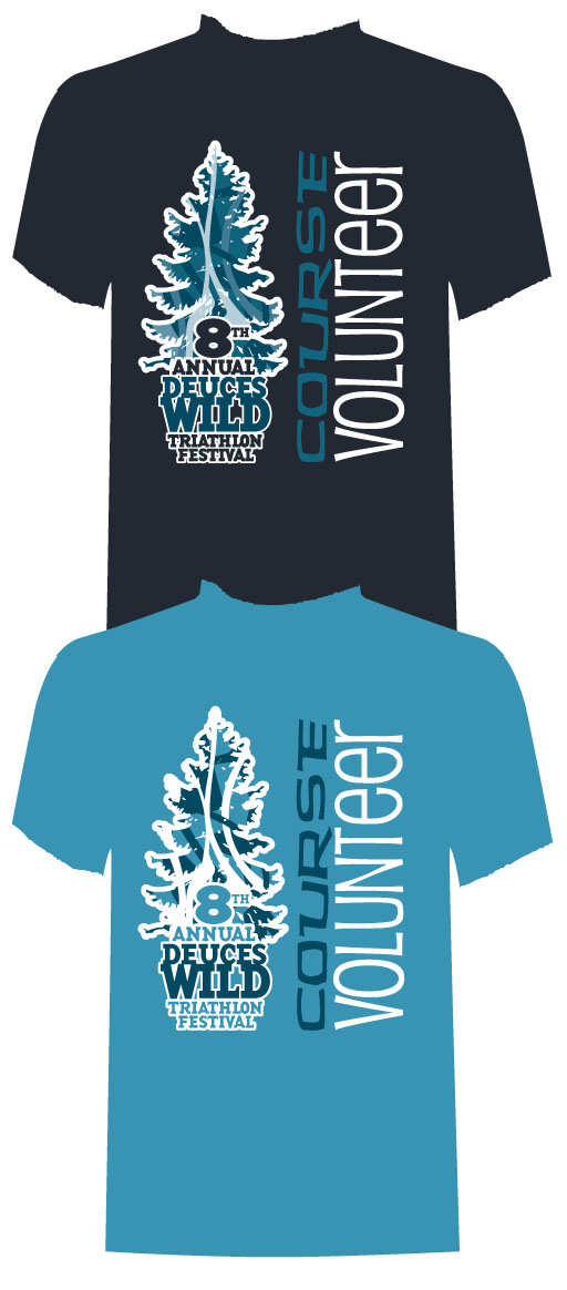
We weren’t quite done. This race is put on by a small army of volunteers, and shirts were needed to make these volunteers easily identified. While running through the backwoods, would you take the direction from some one telling to run “that way” or trust a person with a volunteer shirt on? Take the first choice and you may end up in Colorado. The light shirt was chosen, and with the simplified logo [dare we say it] it may have upstaged the race jersey.

We’ll be posting more designs for clothing that we have worked on, and expect photos of the clothing as well.

ASARCO Mineral Discovery Center

This brochure for the ASARCO Mineral Discovery Center was fun on a few levels. First there is just the general interest in the mines of southern Arizona, a decent economic input for our area. I’ve taken my kids down to the Discovery Center and taken the mine tour. Then there is the saturday morning shootout, a weekly ride that see pros and national team athletes come out and ride every Saturday, and that goes around the mines as well. Also, an old friend help set up the Discovery Center and the exhibits a dozen plus years ago, and I still have a few of his old bookshelves in my house. And the last bit would be that there was not a very large budget for the brochure so it was a fun challenge to make a nice piece without costing the customer much money [like in the “took less than 2 hours” range]. I just may need to head out to the Center again as the mines have been working hard as the price of copper has gone way up.

Click on the either of the following images for a pdf version of the brochure.

El Tour De Tucson ’06 Poster and Jersey

Tucson is well known as one of the best cycling communities in America. Pro cyclists [and triathletes] come to train here, and many move here for the year-round training that our weather provides. Well, we’ll take a ding for the summer, but you just need to get out early in the morning to get in your miles. The Perimeter Bicycling Association of America Inc. [based in Tucson] puts on several events each year, with November’s El Tour de Tucson being the largest. With about 9000 cyclists each year, there is a mix of top-level athletes as well as thousands that set the 108 mile event as there goal and spend the prior months getting into shape to reach that goal. Starting in August there are more and more cyclists out on the roads on the weekend, all in their brightly colored jerseys. Being a cyclist myself, I applaud everyone for making the effort to get into shape. Being healthy is a good thing.

Starting with the Lance Armstrong poster in 1998, I have designed 6 El Tour de Tucson posters and 2 Tour de Phoenix posters. Some are painted traditionally, some have been done entirely on the computer, and the poster for 2006 was a bit more of a line drawing. Every year the process is mostly the same: work on coming up with some promising sketches, and once approved, complete the poster and then make modifications from there. I have always wanted to make some miniature cyclists riding on a cactus, so that is where I started, trying out a few color variations.


The colors seemed to be okay, but the sketches didn’t strike anyone as all that impressive, even though the thought was to paint the poster. That would be hard to mock up without completing the poster – far too many hours on the chance that it may be accepted. I moved on to pencil sketches for the composition and this was chosen — not a whole lot of detail. [click image for a higher resolution version]


Taking that sketch, I made a quick series of color mock-ups and I was given the green light to go ahead. As a side note, that is always a good thing to get, especially when there is not that much to look at.

I redrew the branch and inked it in for a clean-but-rough line, scanned it in at a very high resolution and auto-traced it in Adobe Illustrator. Then came the fun of keeping the art to 5 spot colors and coming up with an attractive design [more on the 5 color limitation in a bit]. After a fair amount of work, 5 colors that worked well together were chosen and the artwork grew into a warm/sunlit side and a cooler shadow side. [click image for a higher resolution verison]

Here is an enlarged version of the nine cyclist bugs, which I also printed out as die-cut stickers on our large format printer. For the kids race, my kids had these stickers all over their bicycles and helmets. There is a bit of a petroglyph feel in these bugs.

The mountains around Tucson were added with the same warm/cool color selection, and because of a time crunch all three branches were the same illustration with the branches recolored. That would be the one thing I would change if I had a chance: the branches and the bugs all needed to be unique. No two bugs alike. Ah well. Most people don’t realize they are all the same until I point it out [I am sorry if I ruined the magic].

After several attempts to fit all the text on the poster in an attractive manner [I love my typography – I believe that is what sets my poster design apart from many of the other posters] I matched the curve in the text at the top with a blue notch at the bottom. It was a hit. But I wasn’t done…

The El Tour folks needed the clothing to match the poster, which is why there was a 5 color limitation. Granted, I was allowed to blend the colors together which was probably a bit of a nightmare for the production artist at the clothing manufacturer. Several comps were created and this one was selected way back at the beginning of the process. Rough, but it was a good direction.

Once the poster was complete, the design had to be reworked to fit into all the different sized patterns. The mountains were too busy so they were dropped out and just the ocotillo branches and bugs were left.

Here is a close up version of the jersey pattern. The art had to fit the smallest jersey as tightly as possible so that the text wouldn’t look like it was floating in the middle of branches and thorns. Pockets were taken into account, and on the front there was the issue of the zipper.

This shot was sent to us from Squadra, the clothing manufacturer. Jerseys, jackets, shorts, and socks were all part of the package — and they sold out, making it one of the most successful jerseys ever. That means I did my job — it was both an attractive design and a successful product for Perimeter Bicycling. As a bonus, I get to see my jerseys being worn all over town. They are most definitely bright and eye catching. [click on the image for a higher resolution version]

Goodbye, Mrs. Tiggy Winkle’s

After a few decades of being in business, Mrs. Tiggy Winkle’s Toys has closed its doors. Much could be said about this being the result of the poor economy, online stores cutting into local stores profits and the loss of small businesses, but they were our friends and now is not the time. They did so many things that were just plain right.

They weren’t so much a store to find the lowest prices as a store to experience the toys. You were guaranteed a request by one of the staff to sprinkle pixie dust on you our your children, and if you came back often enough, you might find yourself in the midst of a raging sponge rocket battle taking over the entire store. So many of the toys were out to be played with, including large wooden train layouts where there would always be a handful of toddlers pushing trains around the tracks. The books they stocked sparked the imagination, as did their toys. At closing, staff would sometimes come around an aisle and find all the knight figurines set up in a battle against the dragons and cute little toys from Japan.

They brought in musicians, helped sponsor shows, had repeated visits from animals from the zoo and their staff-created puppet shows were the best. The big tree would be pushed aside as well as several aisles and the store would be packed out. Mrs. Tiggy Winkle’s was always a place to have fun, no matter your age. Tucson has lost a little bit of life with their closing.

Years ago we helped create their website, wanting an original illustration. With a little bit of Flash, we had some fun, especially on their staff page.

[kml_flashembed movie=”http://www.mbtween.com/p/tiggytoys/staff_xs.swf” height=”311″ width=”512″ /]
Each page had a different illustration, and they were all going to have a lot of animated items, but we held off on that as the economy began to sour. Bubbles were supposed to float up, the bulldozer was going to push the clouds around, the giant bear was to rise up and the slowly return to peeking out over the landscape. The goldfish crackers were to swim around while the hook tried to grab them. In the bottom was a little outhouse, and you would have had to gone to Mrs. Tiggy Winkle’s and used their bathroom to understand. For some children, they didn’t want to go to the store for the toys, but to go see the bathroom.


Mrs. Tiggy Winkle is a hedgehog, and we had her living in a tree stump. The leaves would fall, the door would open and she would peek out. Later on we wanted to have a herd of elephants run behind the stump and have a portal appear and the elephants would run into it and disappear. There was also going be a rocket balloon tower that would rise up and launch a rocket balloon [still one of the best toys. ever.] and more.


It would be wonderful to think that one day they would reopen, but the chances of that are less than slim. Someone else will have to give it a shot, making another toy store one that you don’t just visit but experience. Read their farewell here.

Frost Construction Wall

Ah, Frost. It used to be that you had to live in Tucson to enjoy the wonderful Italian gelato from Frost, but not any more. We printed out their large banner to put on the construction wall encircling their soon-to-be-opened shop in Glendale. Read more about Frost and their story, and then go try them out this summer. Great store, great product.

We had to slightly modify their artwork to make it wrap-friendly on either end, and then we also made sure there were easy breaks between section with the words. It would be hard to go wrong with such great images. Is it wrong to wish for the power to go out at work so that a trip to Frost could be made? I think not.

Click on the image above for a larger version.

Holiday Card

It is getting to be that time in Tucson when someone finally turns the heat on. What better way to escape the heat [other than literally escaping the heat] than to revisit a holiday card from the prior year. Paragon Space Development specializes in environment controls [read that as creating products for both space and dive suits] and their marketing people came up with the great idea of combining the two and have some divers floating in space. Taking their mockup [below] it became a quest of finding the right images and compositing them as realistically as possible.

A few other ideas were worked out, using the comp images from iStockphoto to see which images needed to be purchased.

The last comp was the one, so the two stock photos required were purchased…

and with a bit of masking, modification of the stars and adding to the glow of the earth, a fitting holiday card was born. It is easy to find a decent holiday card, but it takes a little more thought and energy to come up with a card that is worth keeping. Paragon did just that.

Luminarias Box

Though it might seem appropriate today to put up wedding invitations we have designed [yes, even the mbtween blog is not a safe haven from the hubbub around the royal wedding] we will jump back a few years to the box design for some luminarias. These labels were put on the ends of the box as the front of the box would not be shown while stacked, and the lights were not only beautiful but practical as well. The coated metal luminarias on thick outdoor wire cords meant that you could leave these lights out year round. It made me happy as I was getting tired of setting up the bags. Even the plastic bags were a pain and couldn’t handle the Tucson sun.

The lights look fantastic around the pool at night, but this is a little advertising trickery. It makes for a wonderful photo, but please don’t try this at home. Get real pool lights installed, and not lights [and cords] you could potentially kick into the pool.

Look around Tucson — you’ll see these in plenty of yards, and they are quite beautiful.

10 Years in the Making

We’ve made it to the Sweet Sixteen and more. One could say this may be some payback for the 2001 loss to Duke in the championship game, but it may just be better to say that Arizona played one of the best second halfs EVER and transformed Duke from a never-ending powerhouse into a handful of guys that looked lost on the court. *whew!*

If anyone remembers the old NBA Jam video game [they have a new version out now] there were two frequently repeated phrases in the game. “He’s on fire!” and “He can’t buy a bucket!” – we were on fire last night. Let’s hope that fire continues.

The credentials for the previous year had exactly that – some flame action going on. Here are a handful of the credentials, as well as a look into the process of coming up with them.

How much flame is too much flame? Where does “Staff” and the year go? Believe me, there were plenty more iterations than just the few shown here.

On a few of the credentials we went with wood from the court, but should it be Arizona red or more like the original wood?

PAC-10 Champs & March Madness!

A day after the University of Arizona men’s basketball team became the PAC-10 champions and finished an undeafeated season at home I happened to bump into a friend visiting from  Cincinnati. He works with the athletes at Xavier where we pulled their coach. “Thanks for letting us have you coach,” I gleefully told him. Who would have thought that Arizona would be back to being competitive so quickly? Not I. We are back to the big dance, and who knows — maybe we will put in another 25 year string of appearances.

Each year we get to create the credentials for many of Arizona’s teams, and we put a bit more into the job as it is our team as well. In the end, there are individual credentials for a myriad of positions and sets for both season-long and game-by-game passes. If you are thinking of being sneaky, good luck with that — not only do we shred everything that we don’t ship, but we create identification sheets for the security members at the games. Did we mention that we also apply barcodes on credentials? We want everything surrounding the games to be safe, as well as look good [because that is what we do].

Good luck in both the PAC-10 Tournament as well as the big dance — here is hoping that we at least make it into the sweet sixteen!


Massage Therapy Business Card

Over-complicating things is a frequent problem, which is different than just saying «simplify it». It speaks of overworking a design and making it go back instead of just looking for the simplest route. There are times that one has to push through a design to get somewhere better. Sometimes the greatest design looks so simple, but the path to getting there can be very long.

Yes, this makes the design process seem very complicated. Well, it is, or at least it can be. With unlimited time, talent, and budget, you should expect great things. Most of us [if any] live in that world.

For this portfolio piece, it is a combination of soft-but-not-so-soft colors on the left fading away to the right. It gives the perception of all the stress, scars, and pain fading away, which is exactly what Jenna does. Simple, to the point, and attractive.