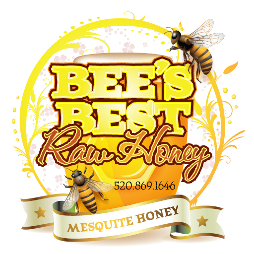
Destination Southern Africa [DSA] was started 10 years ago, offering tailored vacations to Africa. They have plenty of travel packages, and unfortunately we all missed out on going to see the FIFA World Cup in 2010 through them. Next time…
As most companies do, DSA started small and created their own logo. It makes sense – with any new business, cash is tight and spending money a logo is not usually one of the top 10 things clamoring for the business’ money [phones, maybe chairs – those things are important]. Of course, I would say seeing a logo is often the customer’s first interaction with a business, along with the human side of things, but I won’t go that route, at least not today. After 10 years, logos can get a little stale as well as not showing the same level of professionalism that the company now holds. This is where DSA found themselves, needing to sharpen their logo a bit, and I set to work on redesigning it. Below is the original logo, which had a few modifications of type and color over the years. It could be an awkward logo to put into use in material, and the name didn’t stand out as much as it should..
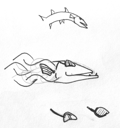
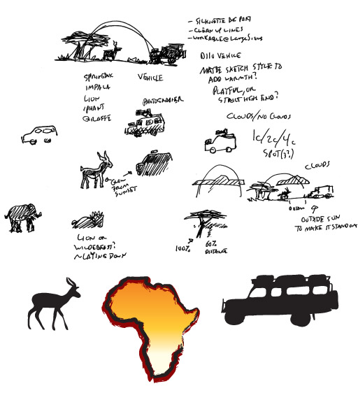
The initial conversation had me going with something similar, trying to keep with the sunset and the silhouette, both the most recognizable parts of the logo. A new Land Rover D110 was also in the mix as that is the safari vehicle most frequently used. Other animals were brought up, and though the focus is to be southern Africa, it is not the most recognizable shape – at least compared to Italy or Japan. Below are some of the quick notes and doodles that came of that first conversation.
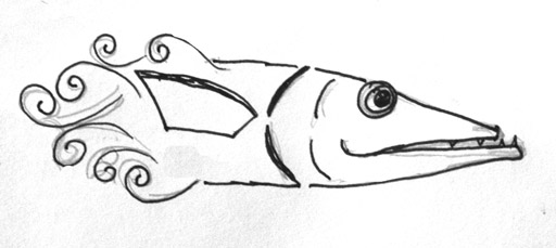
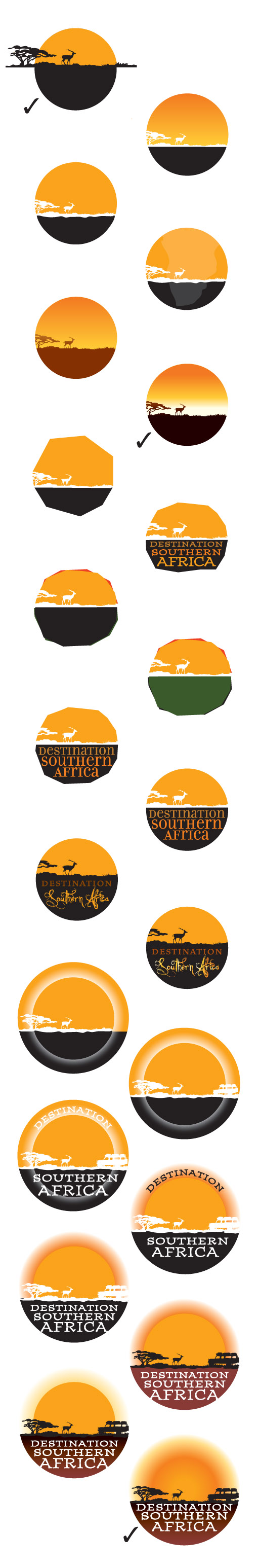
After some mulling over of the concepts in my head [there is always mulling] I ran out several dozen ideas [not all of them are shown]. I stuck with the circle from the original logo and added the bottom as a place to anchor the logo and the text. A few different sunsets, a potentially rough hand-hewn logo, and a double ring to bring the logo into focus seemed to help keep the look while giving the text a prominent place. The 3 logos with check marks were chosen by the customer as ones to develop further. I did have in mind an old stamp or sticker that would have been found on travel trunks in the 1800s, but the push was for something clean and new and easy to use.
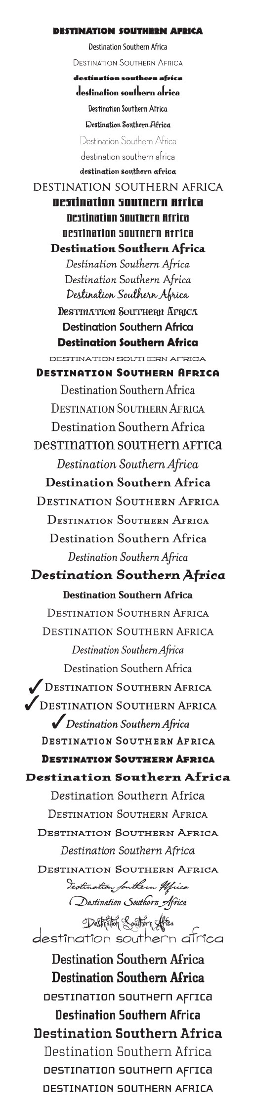
Another large part of logo design is the typeface and potential modification of the letterforms. I pulled a few dozen from our 10,000+ typeface library, ranging from the very clean to the playful. Three of them stood out to the customer, and they all happened to be part of the same family.
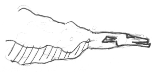
More logos were created, this time with a square bottom to give the text more room, and a giraffe was added in as they are highly recognizable. A few trees were created, but what I really wanted to do [and did] was create a far more dynamic sky and sunset. It really helped make the logo alive while retaining the same general look as the original logo.
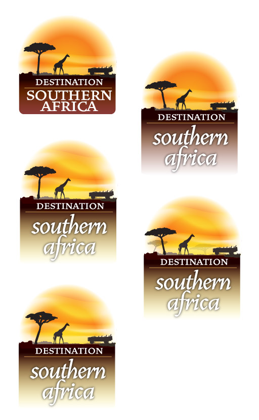
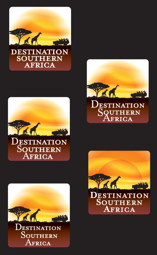
Two logos were chosen from that group, and people were added into the Land Rover as well as baby giraffe.
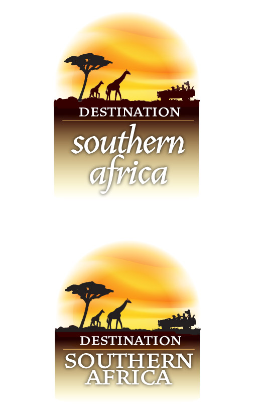
I took both of these and dropped them into an image just to see how the logo would fit, and the transparent edges seemed to work rather well, though I was a bit more fond of the first pair with the darker background.
At this stage in the game, the design is getting pretty tight with only slight modifications, and with that in mind, the client pointed out that the word “Destination”, though equally important in the name, had lesser prominence than “Southern Africa”. The round sun was called into question, and that was squared off as well with a few versions of how the sunset would work. I moved the background over to a rich earthy burgundy to add more warmth to the logo.
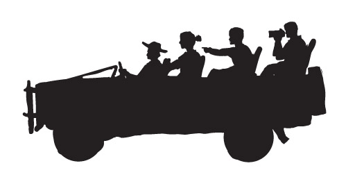
I had forgotten that the silhouette had just been a quick doodle and it was pointed out that the last person in the vehicle looked like a babboon. That might make the safari a bit more exciting, but the vehicle needed an overhaul.
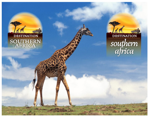
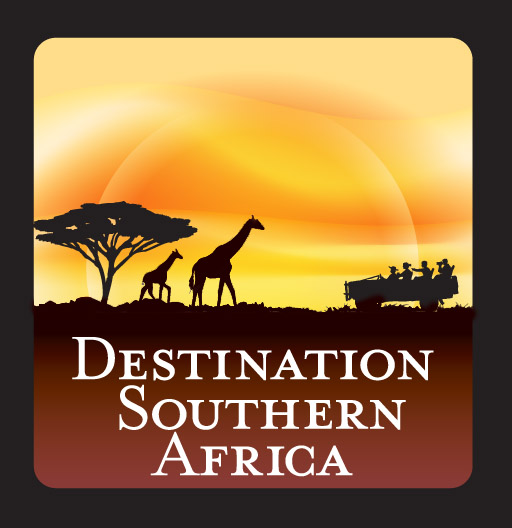
That was it – a little sliding around of the text and DSA has a logo to last at least another 10 years, all created as vector are in Adobe Illustrator [100% Photoshop free!]
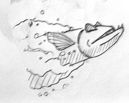
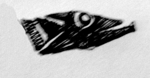
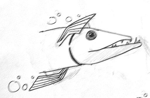
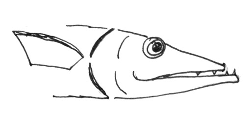
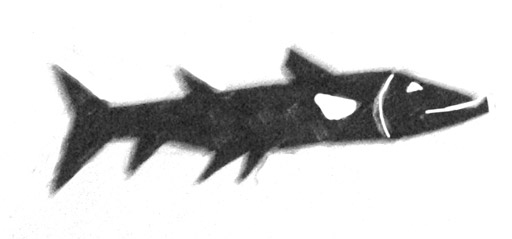
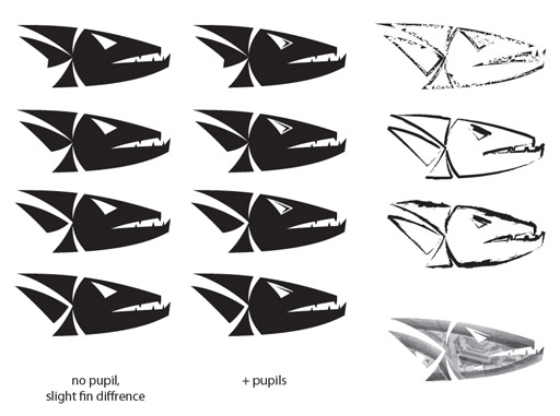
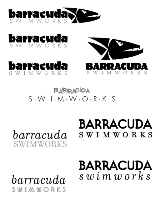
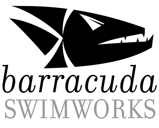
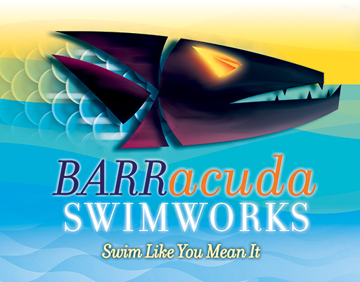
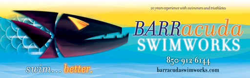
 A friend asked me to create a logo for her swim instruction, but her swim credentials are a bit higher: 4 time US National Champion [18 time US Nationals finalist], Olympic Silver Medalist, 3 time NCAA Champ and 4 time All-American. She won her first national championship at 13 [or was it 12?] and she has a